
Create a PDF document builder
- Introduction
- Prerequisites
- Step 1: Create and configure the data model
- Step 2: Creat the charts
- Step 3: Configure the
- Step 4: Create the dashboard and generate the PDF report
- Congratulations!
Introduction
In this tutorial, we're going to find out how to create a PDF document builder.
To do this, we are going to produce a PDF report on the sales achieved for different product families of a company. It is based on the retailen_2025.xls dataset, which corresponds to fictitious data from a retail company containing information on products and data such as prices, sales, margins, etc.
The steps of this tutorial are as follows:
- Creation of the data model based on the Excel file
- Creation of the 6 charts to be used in the report:
- Summary table of sales by product family
- Table of sales by product
- Monthly sales trend
- Sales by region
- Comparison of sales by product
- Table listing product families for each section
- Creation of the PDF builder
- Creation of the dashboard page used to generate the PDF report
Prerequisites
In order to complete this tutorial, you need to :
- have installed DigDash Enterprise version 2025R2 or higher ;
- be a member of the "Data Model Designer" and "Dashboard Designer" authorization groups;
- download the resources archive containing the retailen_2025.xls file and the images used.
ℹ The screenshots in this tutorial were created using the Chrome browser. There may be slight differences depending on the browser.
Step 1: Create and configure the data model
Import the data source
Here we're going to import the data from the retailen_2025 Excel file we downloaded earlier. To do this:
- Launch the Studio.
- Click the Models tab.
- Click the New model button.

- In the Create a new data model box, select Any types in the Files section.
- In the Search for remote files box, select "Common Datasources" from the Server drop-down list and click the Add file... button.

- In the Select file box, select From your computer, click the Browse... button and find the file retailen_2025.xls
- Click OK.
➡ The file is now saved on the DigDash Common Datasources server and accessible to all users.
- In the Remote File Search box, select the retailen_2025.xls file and then click OK.
The Excel File window appears. It offers data selection options and a preview of the data. Here we will configure the data model.
Configure the data model
The elements in the first row of the table correspond to the heading of the data in each column. We are therefore going to use them as column headings. To do this, in the Data selection section, select the First row as header checkbox.
Filter product families
Here we are going to concentrate on the following product families:
- Deli
- Dessert
- Sport & leisure
- Telecom
We are therefore going to filter the rows for which the Product Family field is equal to the above values. To do this, in the Data selection section :
- Click the Add... button.
- In the Edit filter rule box, select Family, then respond to the regular expression and enter Deli|Dessert|Sport & leisure|Telecom.
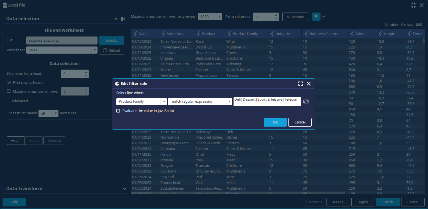
- Click OK.
➡ The other members of the Product Family dimension are greyed out. - Click the Next button at the bottom right to open the data model configuration window.
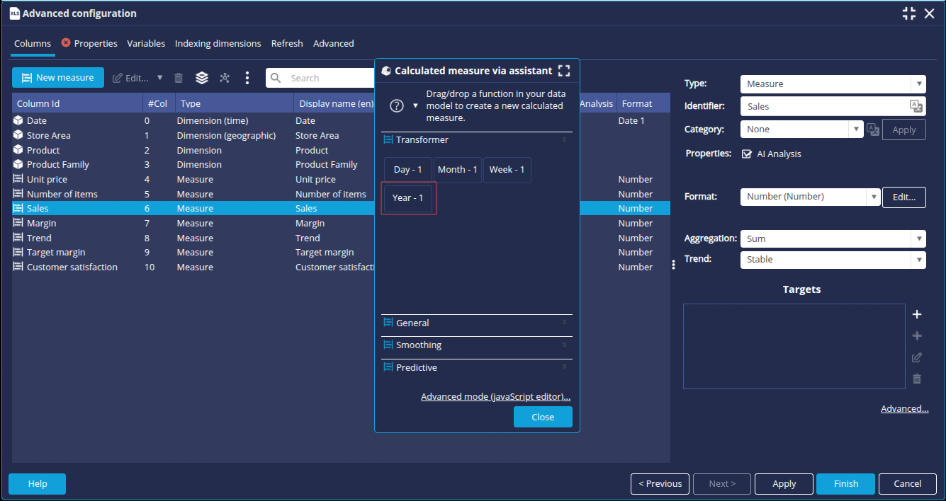
Create the measures Sales (Year - 1) and Sales (% Progression)
We are now going to create 2 new measures calculated with the wizard: Sales (Year - 1) and Sales (% Prgression). To do this
- In the Columns tab, click the New measure button.
- Click Calculated measure:
- To add the Sales (Year-1) measure, drag and drop the Year-1 function from the Transformer tab onto the Sales measure.
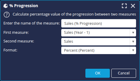
- For the Sales (% Progression) measure:
- Drag and drop the % Progression function from the General tab onto the Sales measure.
- Define the progression between the First measure: Sales (Year-1) and the Second measure: Sales.
- Select the Format : Percent and click OK.
➡ The calculated measures are added to the list of columns.
- To add the Sales (Year-1) measure, drag and drop the Year-1 function from the Transformer tab onto the Sales measure.
- In the Properties tab, enter retail as name for the data model and then click Finish at the bottom right to save it.
Now that the retail data model is configured, we can create the charts based on this model.
Step 2: Creat the charts
We are now going to create the charts that we will insert into our PDF builder.
All the charts created in this tutorial will be based on the retail data model.
To create a chart (flow), click the New Flow button and then select the desired type of flow.
Summary table of sales by product family
- Create a new Cross table.
- Select the data model and enter the name Summary of sales by product family.
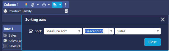
- Drag the Product Family dimension onto the Column 1 axis.
- Place the measures Sales, Sales (Year-1) and Sales (% Growth) on the Line 1 axis.
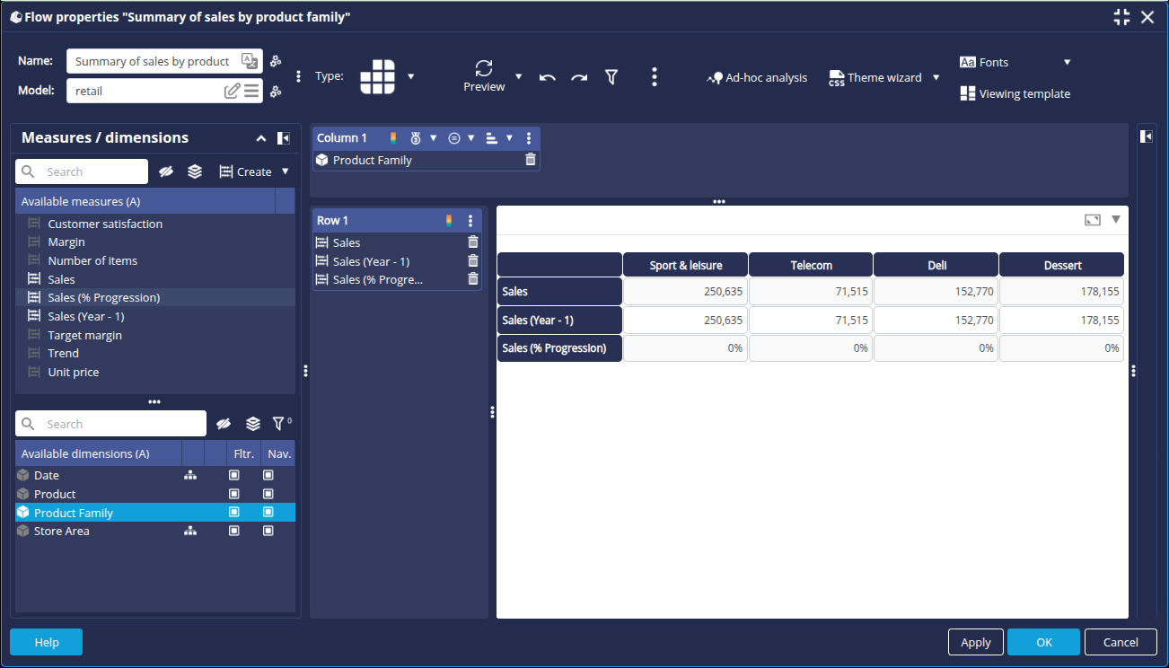
- Click the sort button for the Column 1 axis and apply a descending sort on the Sales measure.
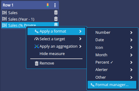
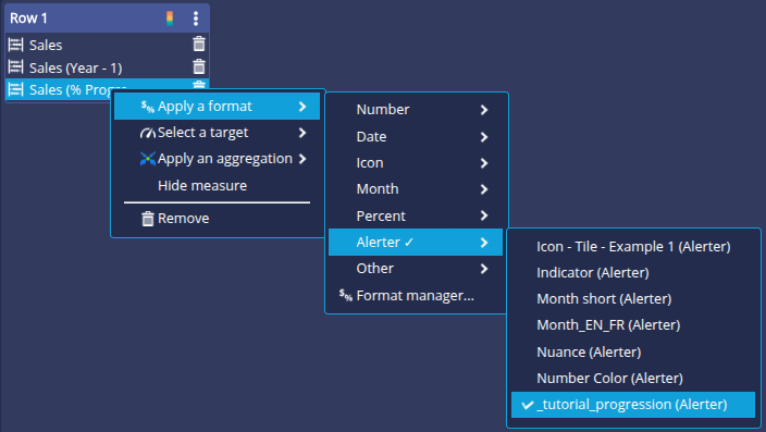
We are now going to add an alert format to the Sales (% Progression) measure :
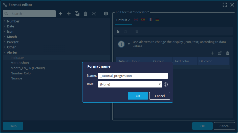
- Right-click the Sales measure (% Growth) and then click Apply a format -> Format manager...
- In the Format Editor, select Alerter and then click the + button to create a new alerter format _tutorial_progression.
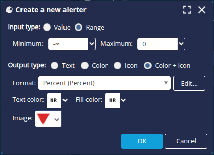
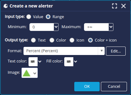
- Click the + button in the Format Editor section on the right to create the following alerts with the Output Type Colour + icon and the Format Percent:
- Value 0: equal sign
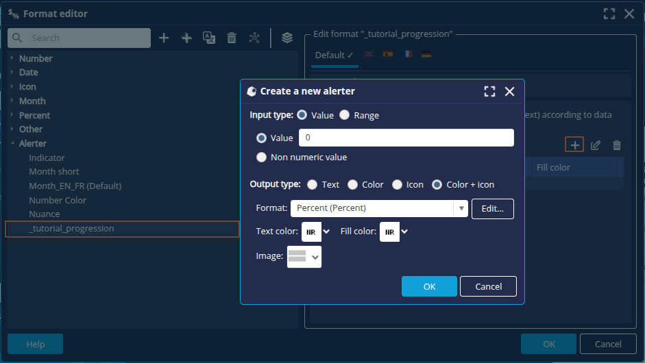
- Interval -infinite to 0 : red down arrow
- Interval 0 to +infinite: green up arrow
- Value 0: equal sign
- Click OK and select the _tutorial_progression alert format for the measurement.
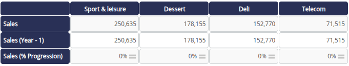
➡ We obtain the following display in the table:
- Click OK at the bottom right of the window to save the Flow.
Table of sales by month
- Create a new Cross table.
- Select the data model and enter the name Table of sales by month.
- Drag the Date dimension onto the Column 1 axis (at Month level in the Date hierarchy).
- Place the Sales, Sales (Year - 1) and Sales (% Progression) measures on the Line 1 axis.
- Apply the _tutorial_progression alert format created earlier to the Sales (% Progression) measure.
- Click the sort button
 on the Column 1 axis and apply the Data Model Sort to sort the months in chronological order.
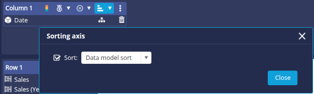
- Click OK at the bottom right of the window to save the FlowFlow.
Monthly sales trend
- Create a new Lines flow.
- Select the data model and enter the name Monthly sales trend.
- Place the Date dimension on the Abscissa axis (at the Month level of the Date hierarchy).
- Place the Sales measure on the Lines axis.
- From the Specific parameters tab in the right-hand panel, add the Circle marker (contained in the Other category).
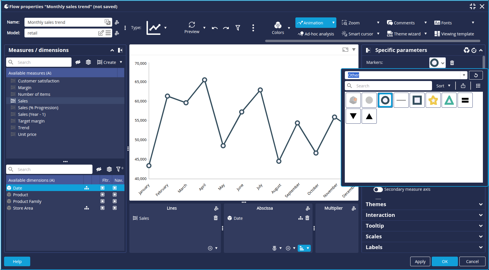
- Click OK at the bottom right of the edit window to save the Flow.
Map of sales by region
- Create a new Map chart.
- Select the data model and enter the name Sales by region.
- Drag the Sales measure onto the Measure Axis.
- Drag the Store area dimension onto the Geography axis: select the Continent level of the Geography hierarchy and tick the Add the "Navigate hierarchies" action box.
- In the Interaction tab of the right-hand pane, tick the Navigate in hierarchy box if filter applied.
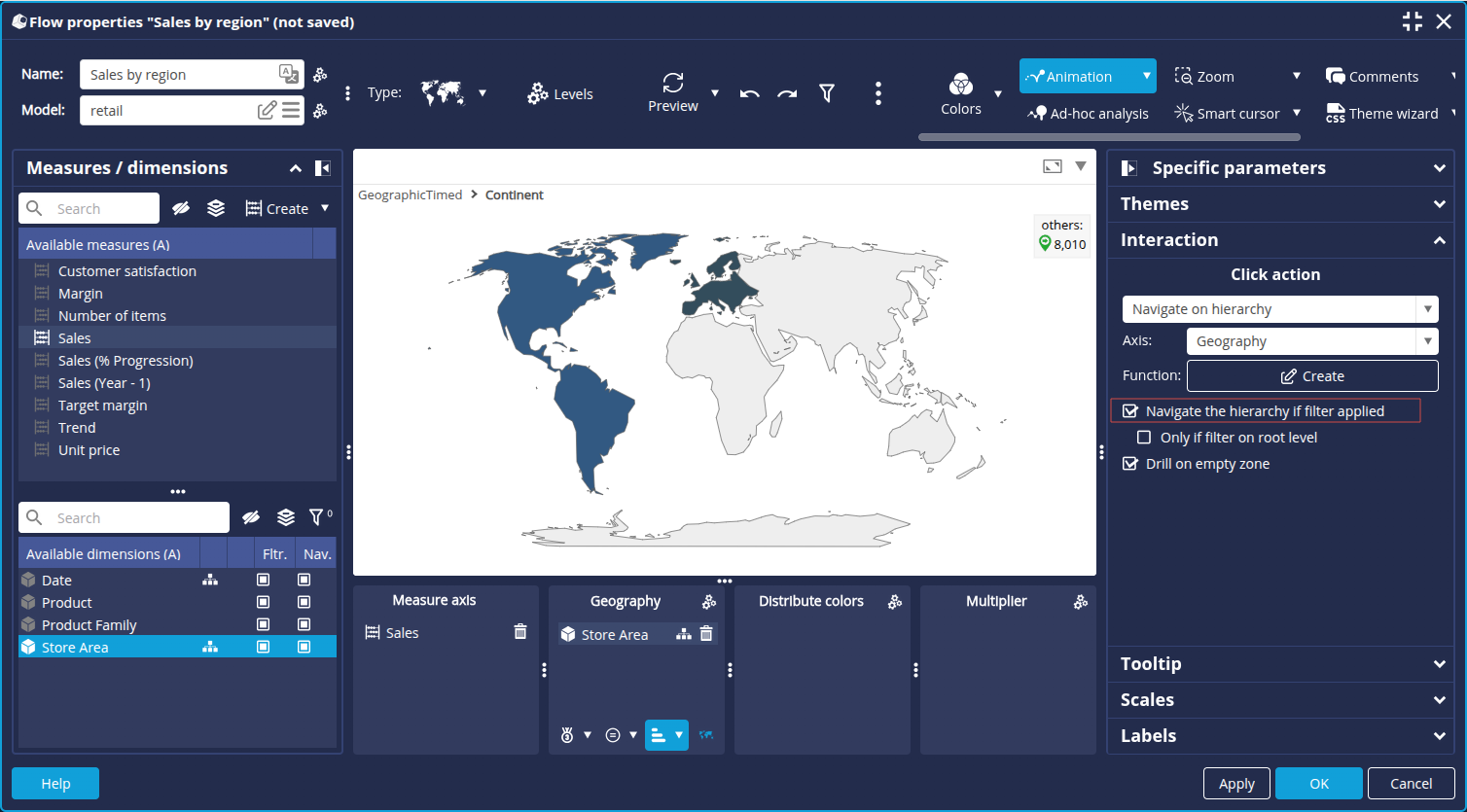
- Click Colors in the toolbar to display the color options.
- Click the Edit button
 to the right of the main palette to open the Color Palette Setup.
 - Click the + button to create a new colour palette:
- Enter the name _tutorial_map.
- Define the 2 palette colors: color codes #FFEBD7 and #B15900.
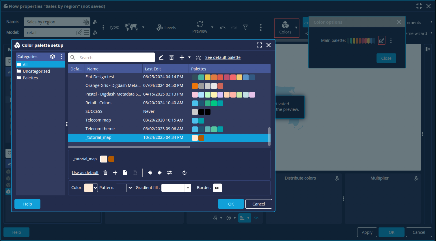
- Click OK.
➡ The new color palette is applied to the map.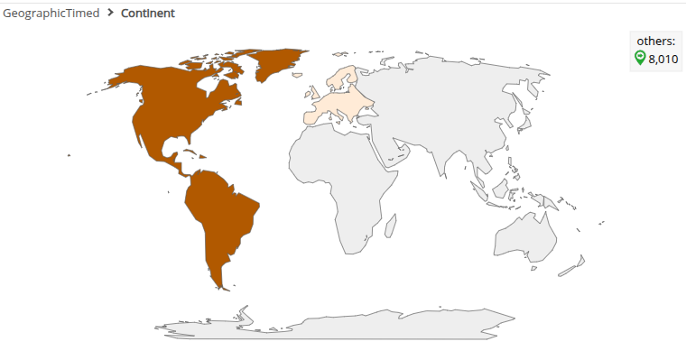
- Click OK at the bottom right of the edit window to save the Flow.
Comparison of sales by product
- Create a new Bar chart.
- Select the data model and enter the name Comparison of sales by product.
- Drag the Product dimension onto the Bar axis.
- Drag the Sales measure on the Stacking axis.
- Modify the color distribution in the color options: activate the color distribution in the coloModify the colo distribution on the Bars axis.
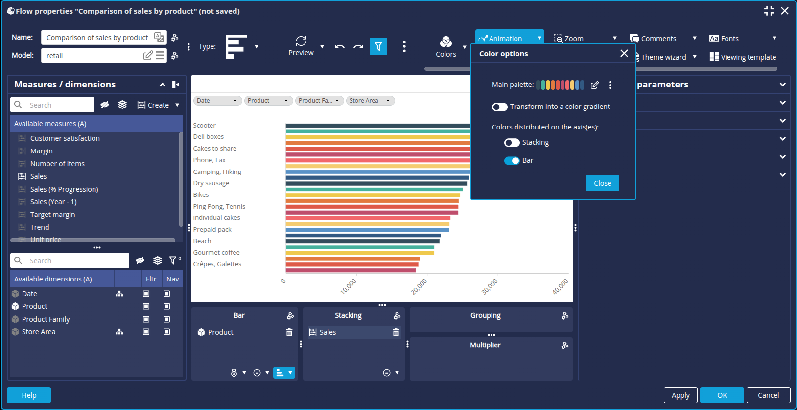
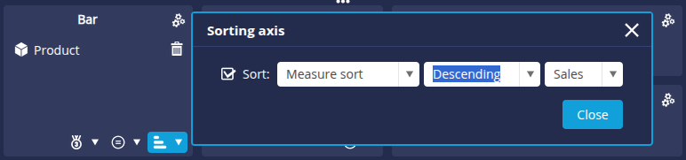
- Click the sort button on the Bar axis and apply a descending sort on the Sales measure.
- Apply the Nbr. Abbrev. format to the Sales measure.
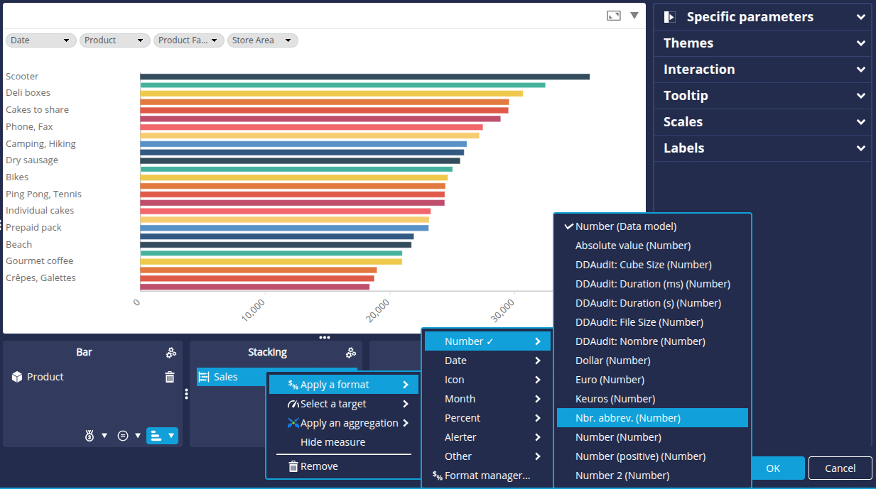
- In the Labels tab of the right-hand panel:
- activate Content of the bars.
- select the Automatic font color box.
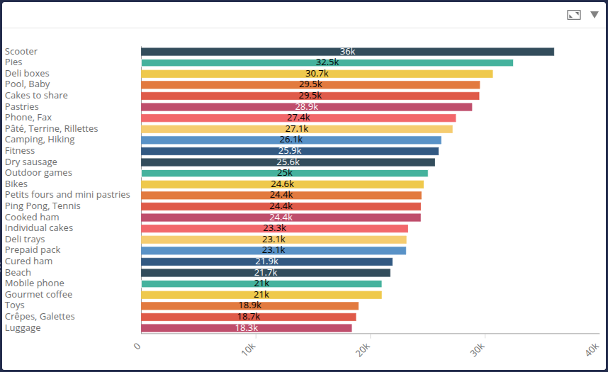
- Click OK at the bottom right of the window to save the Flow.
Table listing the product families
We are going to create a table listing the product families that we are going to use to create a section. This section will be used to duplicate the sales details page for each product family contained in the table.
- Create a new Flow of type Table.
- Select the data model and enter the name Product family List.
- Drag the Product Family dimension onto the Column 1 axis.
- Click the sort button for the Column 1 axis and apply an ascending alphabetical sort.
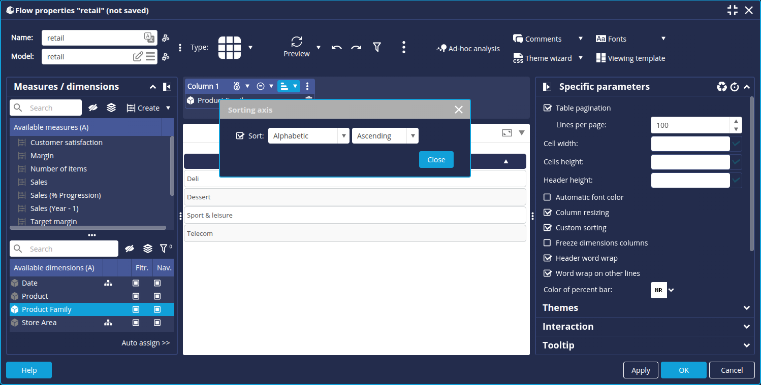
- Click OK at the bottom right of the edit window to save the Flow.
We have created all the charts required for the report. Now we're going to create the PDF builder.
Step 3: Configure the PDF builder
Here we're going to create and configure the PDF document builder. We're going to add the graphics we created earlier, as well as text boxes, images, page numbers, etc. to create a complete report.
Create and define the properties of the PDF builder
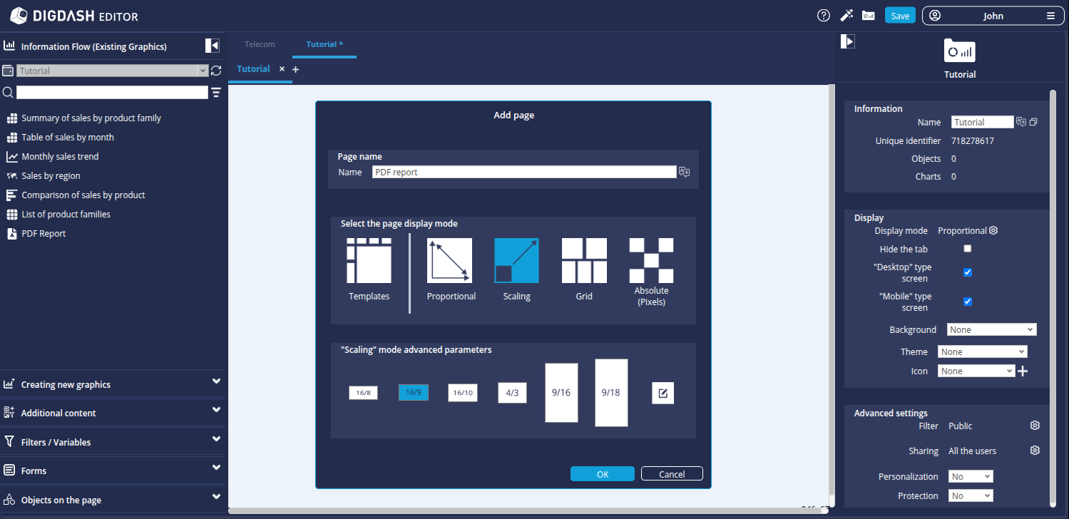
- From the Flow tab, create a new PDF document builder.
- In the Properties tab, name this Flow PDF Report.
- Define the output name of the PDF file in the Export name field: tutorial_report_sales_${filter.Date}_${filter.Store Area}_${date.yyyyMMddhhmm}.
- Click the Editor button.

➡ The PDF document builder editor opens. Here we will configure the PDF builder template.
Modify the page parameters
First of all, we're going to modify the page layout:
- In the Settings tab of the right-hand panel, change the document to A4 landscape format (297 x 210 mm).
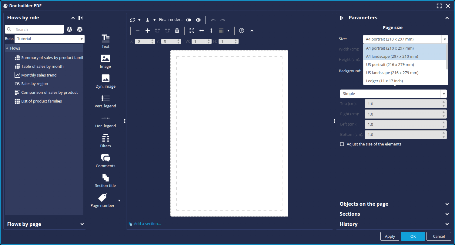
Configure the cover page
On the first existing page, which will act as the cover page, we're going to add :
- A header banner that will be repeated on each page (image)
- A footer banner that will be repeated on each page (image)
- Page numbering, repeated on each page (text)
- A logo (image)
- A title (text)
Add the header banner
To add the image corresponding to the header banner :
- Click the Image button.
- Click on an empty zone on the right-hand side of the page to create an image zone.

- Click on the
 button in the created zone and then click Edit to open the Icon Manager.
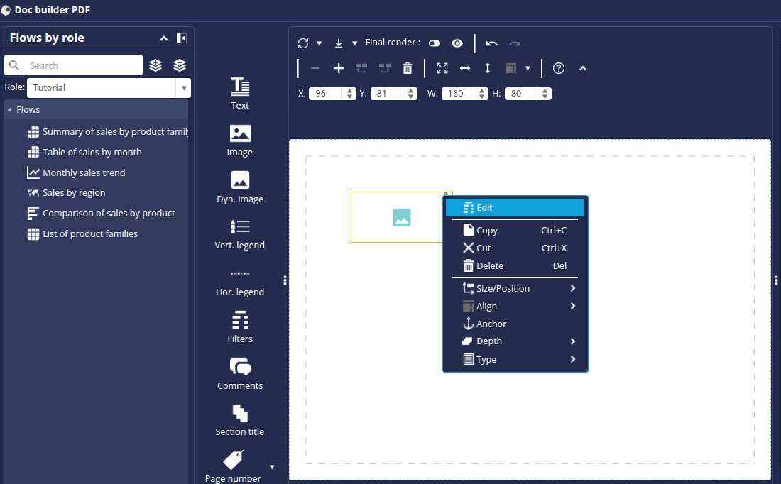
- In the Indicators tab, click Add a custom icon.
- Add the 2 images _custom_tutoriel_pdf_banniere_haut.png and _custom_tutoriel_pdf_banniere_bas.png (downloaded previously) then click OK in the Add a custom icon window.
- In the Icon Manager window, select the image _custom_pdf_tutorial_banner_top.png then click OK.
The first image is now present in the PDF template. To move and resize it, you can select it then drag and drop it or hold down one of the corners. To be more precise, you can also enter values directly in the fields in the toolbar above the page:
- X (X coordinates from the left edge of the page)
- Y (Y coordinates from the top edge of the page)
- W (element width)
- H (height of the element)
- Resize it to the width of the page and position it at the top of the page.
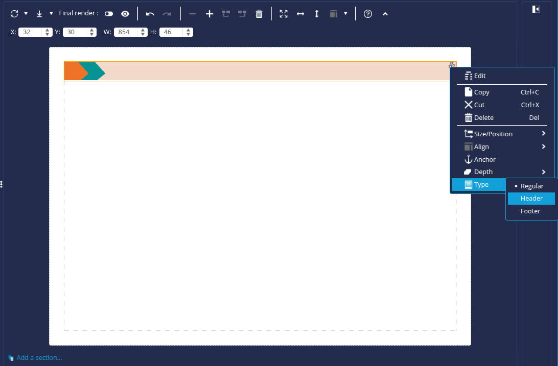
- Click the button again, click on Type and then select Header : this will allow this element to be repeated on all the pages of the PDF report.
Add the footer banner
To add the footer banner, perform the same actions as above. For this element :
- Select the image _custom_pdf_tutorial_banner_bottom.png.
- Resize it to the width of the page like the previous one and position it at the bottom of the page.
- Select the Footer type.
Add the logo
To add the logo :
- Click the Image button.
- Click on an empty zone on the right-hand side of the page to create an image zone.
- Click on the button of the created area and then on Edit.
➡ The Icon Manager appears. - In the Infographics tab, click Add a vector icon.
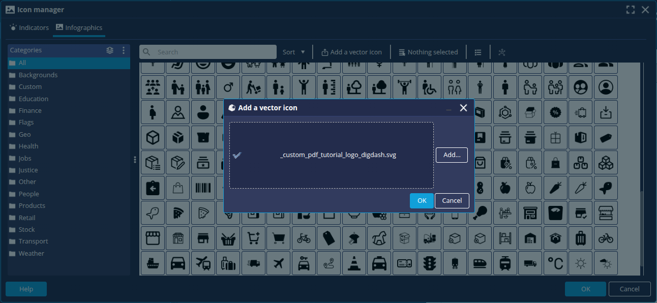
- Add the image _custom_pdf_tutorial_logo_digdash.svg (downloaded previously)
- Select it and click OK.
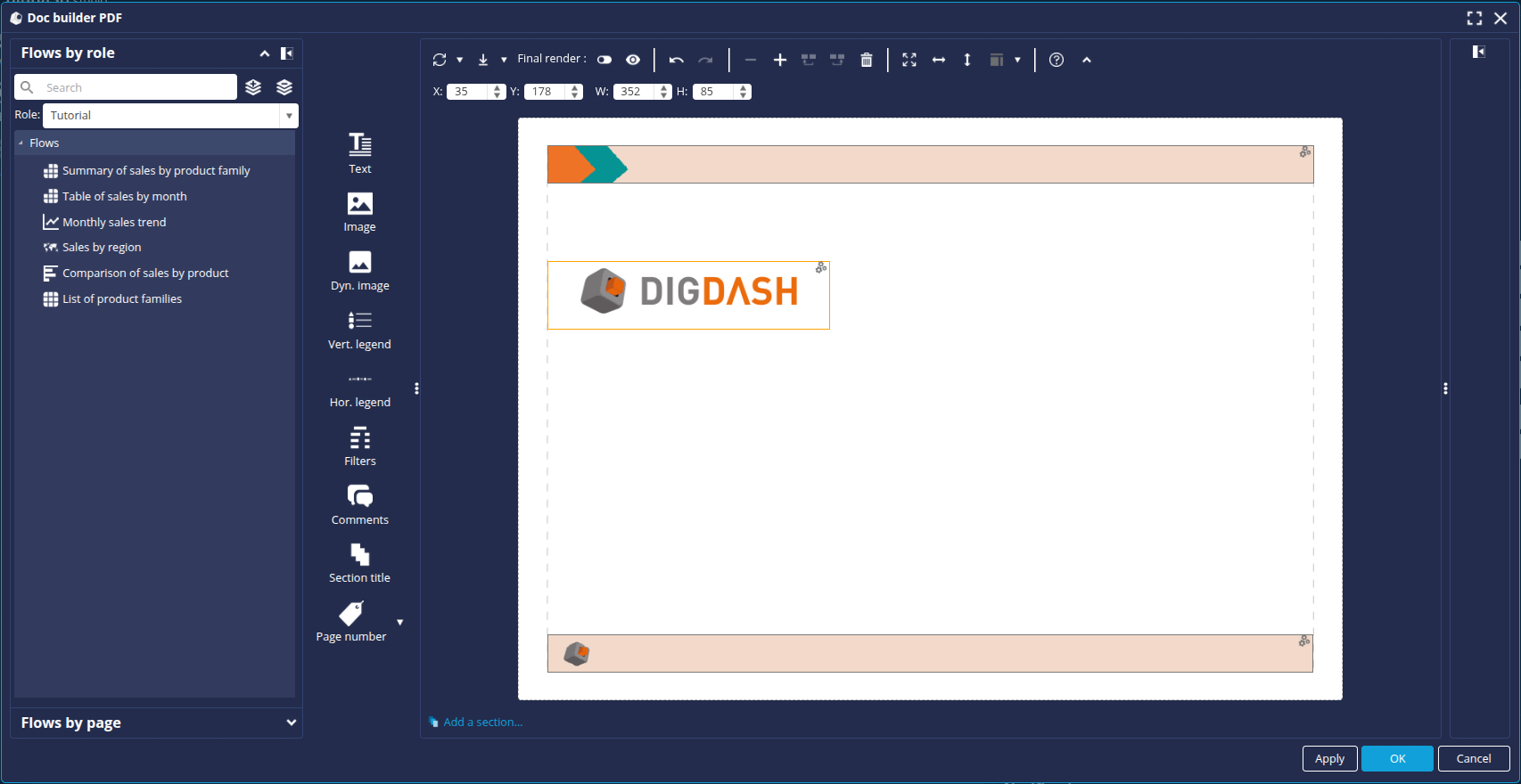
- Resize it and position it as shown below:
Add text
To add text :
- Click the Text button.
- Click on an empty area of the page on the right to create a text zone.
- Click the menu button of the zone you have created and then click Edit.
- In the text zone, fill in the texts below, adding a line break between them:
- Sales indicators report
- Report date: ${date.dd/MM/yyyy}
- Select the first line of text, set the font size to 72 and centre.
- Select the second line of text, set the font size to 16 and centre.

- Click OK.
- Resize and position the text box as shown below:
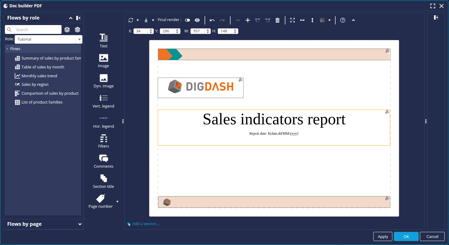
Add page numbers
To add page numbering:
- Click the Page Number button and then select Page Number (Footer).
➡ Page numbering is added automatically at the bottom right of the page.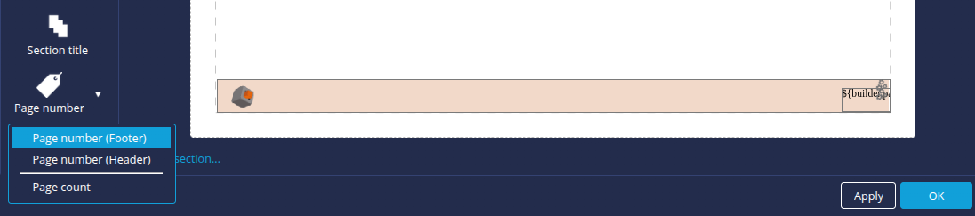
The cover page is now complete. We're going to add a new page to our PDF. To do this, click on the + button on the toolbar above the page.
You can switch between the different pages using the arrows at the bottom.
Configuring the summary page
In this second page, which will be the summary of the sales indicators, we are going to add :
- A title (text)
- 2 description texts (text)
- Charts:
- Summary table of sales by product family
- Monthly sales strend
- Map of sales by region
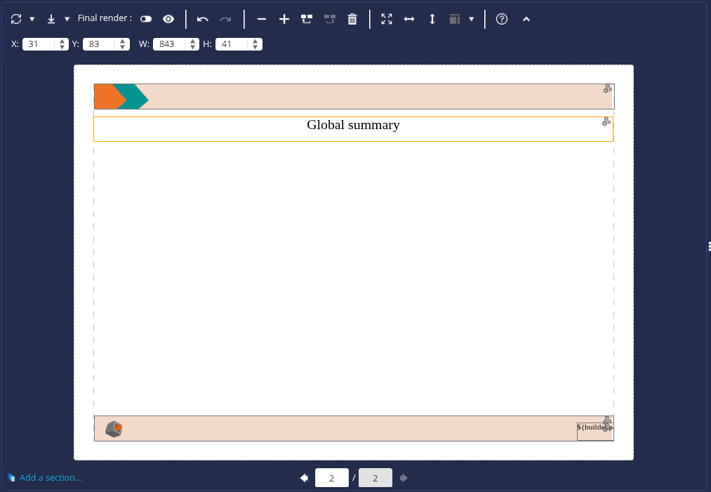
Add title
To add a title :
- Click the Text button.
- Click on an empty zone on the right-hand side of the page to create a text zone.
- Click the menu button of the zone you have created and then click Edit.
- In the text editor, enter the title: Global summary.
- Set the font size to 28 and centre
- Click OK.
- Resize the text box and position it as follows:
Add the description texts
To add the description texts, follow the same steps as above:
- In the first text box, enter the following text: Below is a table summarising the sales achieved by the different product families for the year _KEYWORD_YEAR_ compared with the previous year.
- In the second text box, enter the following text: The following pages detail sales by product family.
- Resize and position the text boxes to obtain a result similar to the illustration below:
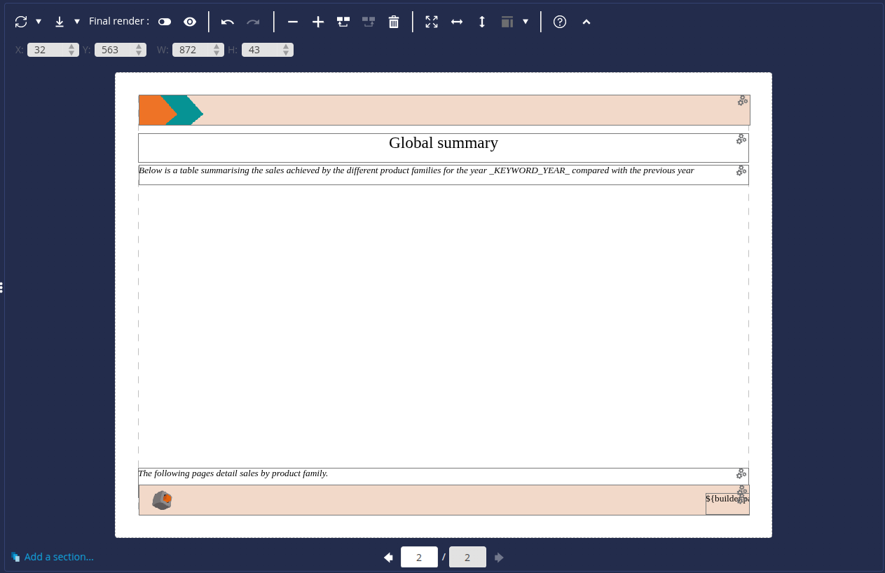
Add charts
To add charts :
- In the FlowFlow by role tab on the left-hand panel, select the role containing your charts.
- Find the chart Summary of sales by product family.
- Drag and drop it from the list of Flows onto the page.
- Do the same for the other 2 charts: Monthly sales trend and Sales by region.
- Resize and position the chart areas to obtain the following model:
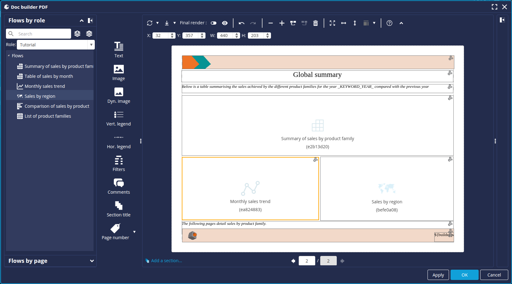
- You can check the rendering of the various elements by activating Final Rendering in the toolbar above the page. If the area is not suited to the content, you can resize it.
Now that the summary page is complete, we're going to add a new page to our PDF. To do this, click the + button as done previously.
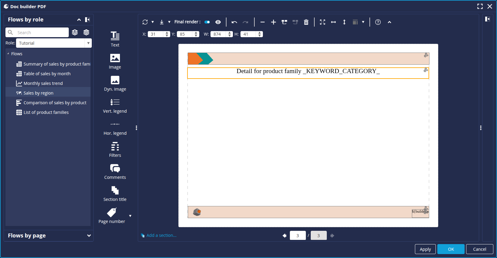
Configure the detail page
In this third page, which will detail the sales indicators by product family, we are going to add :
- A title (text)
- A description (text)
- Charts:
- Table of sales by month
- Comparison of sales by product
- Sales by region
This third page will use the notion of section, i.e. this page (and the elements it contains) will be repeated and filtered according to the values in a table (List of product families).
Add a title
To add the title :
- Click the Text button.
- Click on an empty zone on the right-hand side of the page to create a text zone.
- Click on the menu button of the zone you have created and then click Edit.
- In the text box, enter the following text: Detail for product family _KEYWORD_CATEGORY_
- Select the text then set the font size to 28 and centre.
- Click OK.
- Resize and position the text box as shown below:
Add charts
To add charts :
- In the Flow by Role tab of the left-hand panel, select the role containing your charts.
- Drag and drop the Table of sales by month from the left-hand panel onto the page.
- Do the same for the other 2 charts: Comparison of sales by product and Sales by region.
- Resize and position the chart areas to obtain the following model:

- As on the previous page, activate Final rendering to check the rendering.
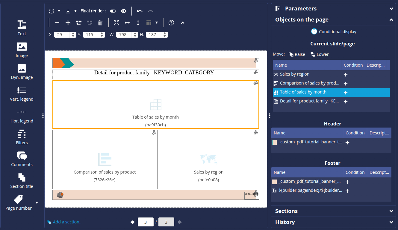
We're going to define a section to display this third page for each product family. To do this
- Select the Sections tab in the right-hand panel.
- The index corresponds to the page number. Select index 3 then click on Add...
➡ The Section Source dialog box is displayed. - Select the role used and then the Product family list table.
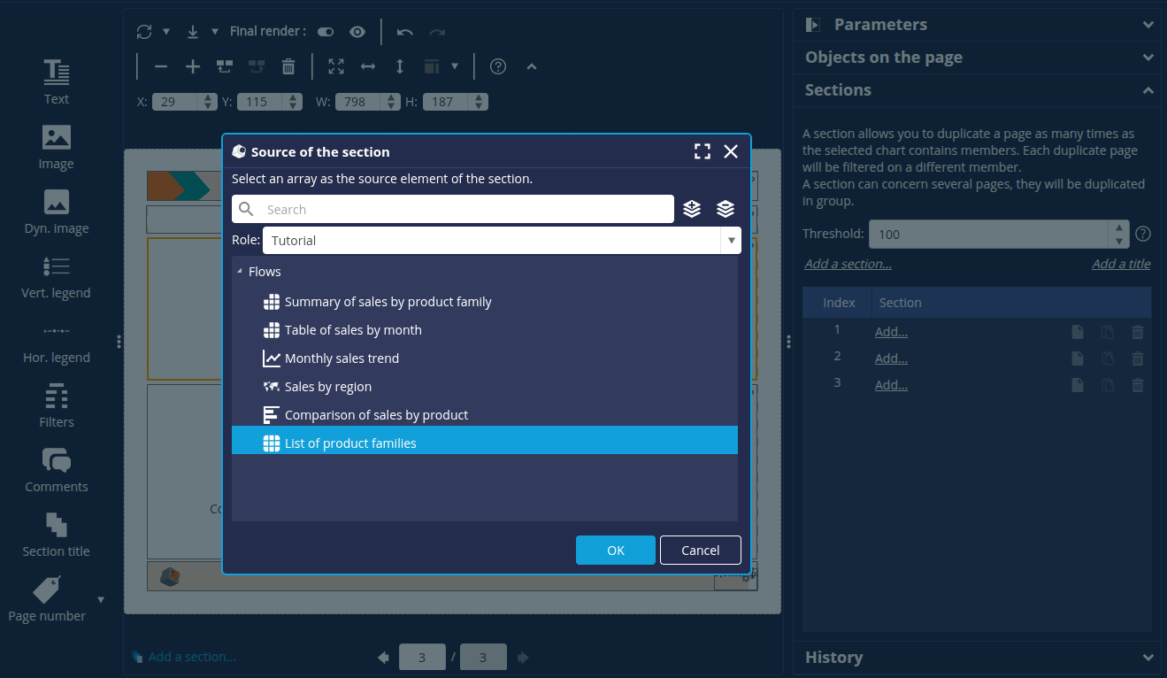

- Click OK.
➡ The section is added. It is also displayed below the page.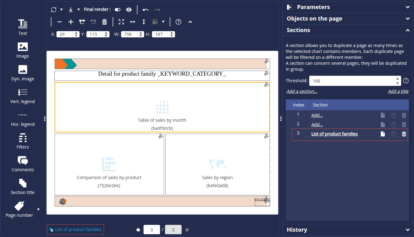
The template is now complete. Click OK at the bottom right of the window to save it and close the editor.
Configure word substitution
The PDF report contains certain keywords which will need to be replaced by the data value when the report is generated. To do this, we set up a keyword substitution:
- In the Properties tab of the Flow Properties box, click Configure.

- Open the Word Substitution tab.
- Click the Add... button.
- In the Key field, enter the keyword _KEYWORD_CATEGORY_.
- In the Value field, enter ${filter.Product Family} then click OK.
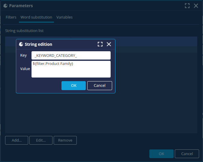
- Repeat the operation to add a second substitution:
- In the Key field, enter the keyword _KEYWORD_YEAR_.
- In the Value field, enter ${filter.Date}
- Click OK.
The PDF builder is now complete.
We will now create a dashboard with a button to run the PDF document builder.
Step 4: Create the dashboard and generate the PDF report
Create the dashboard page
To create the PDF Report dashboard page :
- Launch the Dashboard Editor.
- Select the role you are using.
- Click the + button to create a new dashboard page and name it PDF Report.
Add a PDF builder run button
We're now going to add a button that will allow us to generate the PDF report from the dashboard page.
- From the Additional content tab, drag and drop a button onto the newly created empty page.
- Select the button and in the Display section of the right-hand panel, enter PDF report in the Text field.
- In the Actions section, click the Add button.
- In the Action dialog box, select the Execute a PDF document factory Flow action and then select the PDF Report flow.
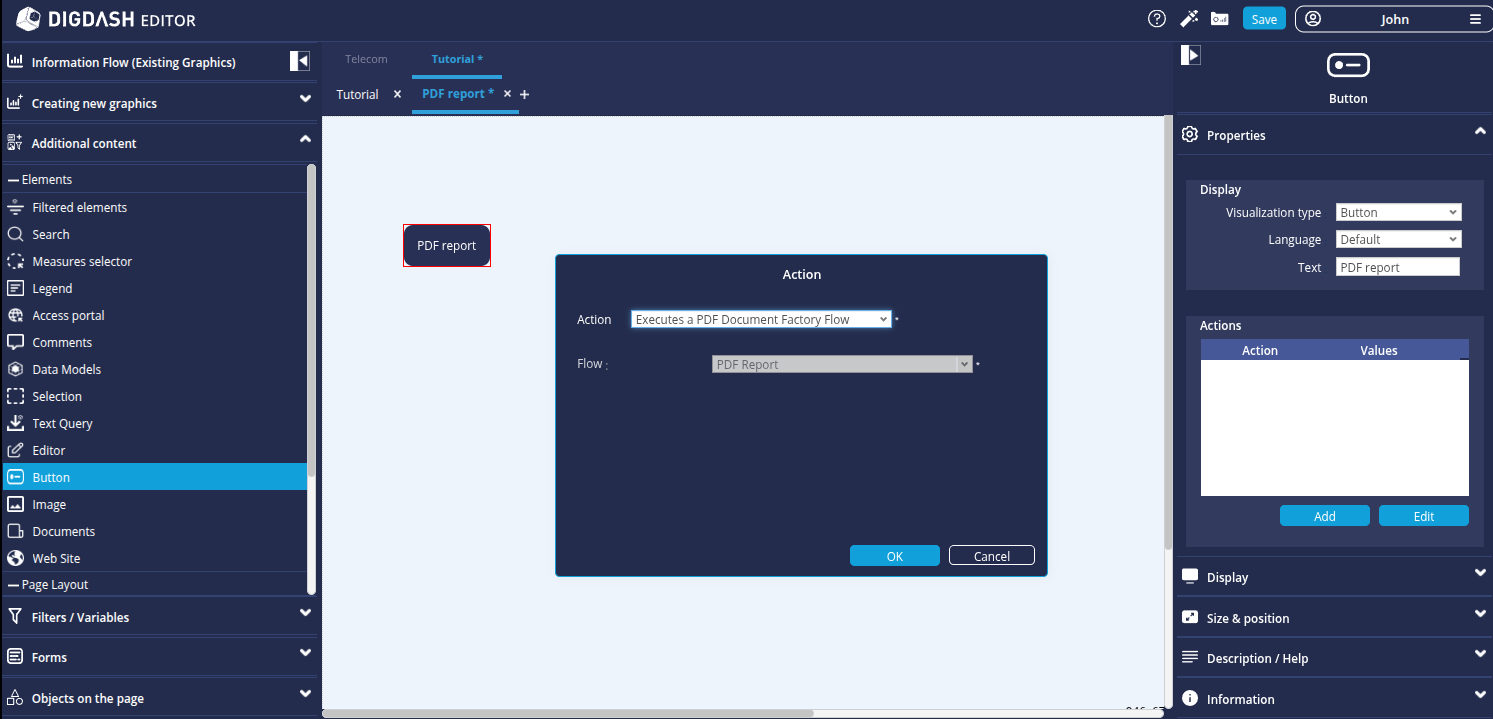
- Click OK.
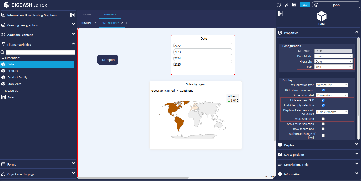
Add a Date filter
Here we add a Date filter which will allow us to select the desired year for the report.
- As it is not possible to add a filter to a page that does not contain any charts, add the Sales by region chart from the Information flow (Existing graphics) tab on the page.
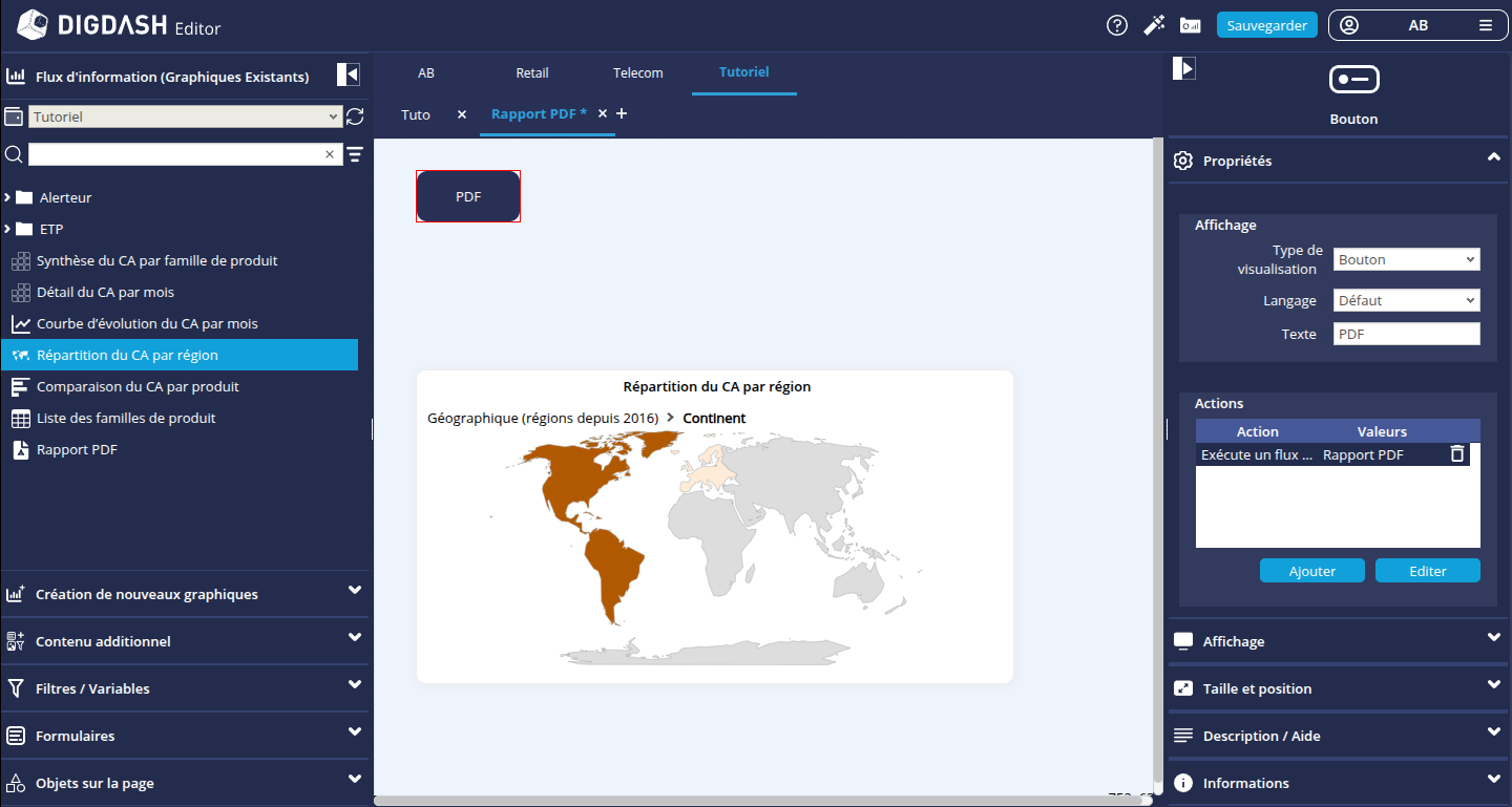
- From the Filters/Variables tab, add a filter on the Date dimension.
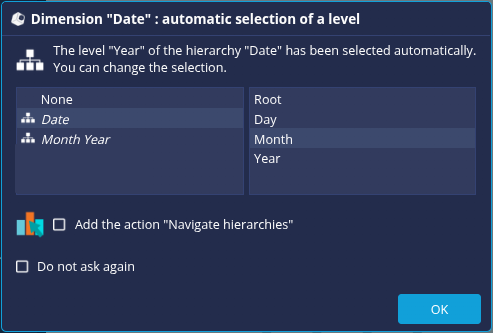
- In the filter properties panel, select Date and Year from the Hierarchy and Level drop-down lists.
- The report data will be filtered on a given year. In the Display section of the same panel:
- Check the Hide element "All" box .
- Check the box Prohibit empty selection.
- Uncheck the Multiple selection box.
Generate the PDF report
Now we just have to access the Dashboard and generate the PDF report.
- Click the Dashboard access button
 and save your changes.
 - In the dashboard, select a year and then click the PDF report button to generate a PDF report.
For example, if we select 2024, we get the following report .
If we filter geographically at country level for France for the year 2018, we obtain the following report
Congratulations!
You've successfully created your first PDF document builder.
Now all you have to do is create your own report using your data!