
Tutorial : Dashboard Creation Wizard
- Introduction
- Prerequisites
- Retrieving the source file
- Step 1: Connecting to the Dashboard Editor
- Step 2: Loading data and editing the data model
- Step 3: Creating the customised dashboard: first charts
- Step 5: Finalising the Absenteeism dashboard page
- Step 6: Creating a second "Payroll" dashboard page
- Step 7: Viewing the dashboard
- Congratulations!
Introduction
This tutorial introduces you to the Dashboard Creation Wizard.
The Dashboard Creation Wizard, included in the Dashboard Editor, allows you to create a dashboard from your data file intuitively, without any intermediate steps.
This tutorial uses a human resources dataset from a company in the Paris region, containing information on staff and data such as salaries, absenteeism, etc.
We will carry out all the steps from loading the data to creating the graphs and integrating them into the dashboard pages.
Before we do that, however, we'll check that the prerequisites for this tutorial have been met.
Prerequisites
In order to complete this tutorial, you will need to :
- have installed DigDash Enterprise version 2025R2 or later;
- be a member of the "End-user for Self-Service BI" authorisation group;
These requirements are detailed below.
DigDash Enterprise version (2025R2 or later)
To be able to follow this tutorial, you need to be using version 2025R2 or later of DigDash Enterprise.
To find out which version you are currently using:
- Log in to the DigDash Enterprise home page as described in the section Login to DigDash Enterprise section of this tutorial.
- Explore the central area at the bottom of the page: the version of the installation currently in use is displayed at the bottom.
- If you do not have a sufficiently recent version of DigDash Enterprise, contact your administrator or your DigDash contact. You can also consult the Upgrade guide.
If you do not have DigDash Enterprise and need to install it yourself, please contact your administrator or your DigDash contact. You can also consult the Installation guide. Then go to the Connection section of this tutorial.
Authorisation group "End-user for BI Self-service
In order to use the Dashboard Creation Wizard functionality, your DigDash Enterprise user account must be a member of the"End User for BI Self-service" authorisation group.
If you do not have administrative rights, or if in doubt, contact your DigDash Enterprise administrator.
Retrieving the source file
In order to complete this tutorial, you must first retrieve the source data file: the Excel file .
Please click on the file name to download it.
Step 1: Connecting to the Dashboard Editor
Once you have checked the prerequisites in the previous section, you can connect to the Dashboard Editor.
It is from this editor that we will launch the Dashboard Creation Wizard.
In this section, we will log in to DigDash Enterprise for the first time and take a brief tour of the home page before accessing and exploring the Dashboard Editor.
Logging to DigDash Enterprise
Logging to the home page
- First of all, make sure you have the internet address of the DigDash Enterprise installation as well as your user name and password.
- Your DigDash Enterprise administrator must have given you this information beforehand.
- If in doubt, please contact your DigDash Enterprise administrator.
- Using your web browser, go to the address you have been given: the DigDash Enterprise home page will be displayed.
Home page overview
Once you have completed the previous connection stage, the following home page will be displayed in your browser.
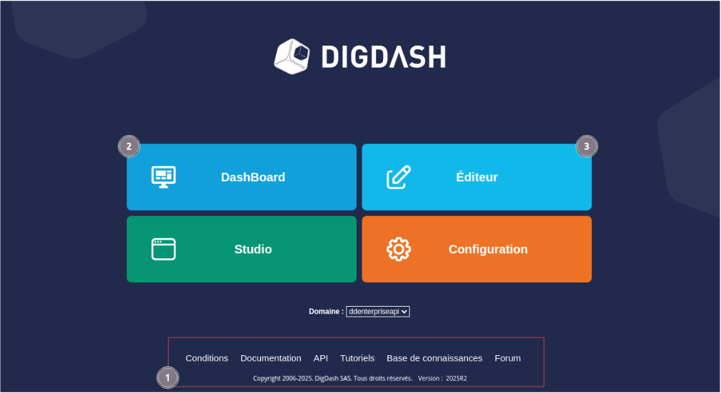
This home page contains a main menu giving access to the various components of DigDash Enterprise as well as an insert giving access to various items such as documentation or the software version.
The numbered items are the ones we are interested in for this tutorial. They are detailed in the table below:
| 1: Help and version | In the central area at the bottom of the home page, you can access help on DigDash Enterprise in the form of online documentation and a forum. The version currently in use is also displayed in the lower part of this area. |
|---|---|
| 2: DashBoard | The DashBoard button gives you access to the dashboards you or your team have already created. From this menu, you can view the dashboard built in the wizard. |
| 3: Dashboard editor | The Dashboard Editor button gives you access to dashboard editing. This is why, in this tutorial, we will concentrate mainly on this part of DigDash Enterprise. |
As you will have noticed, the main menu also provides access to the Configuration and Studio components. These provide advanced functionality and configuration elements that are not covered in this tutorial.
Connecting to the Dashboard Editor
- From the home page, click the Dashboard Editor button: a login page opens.
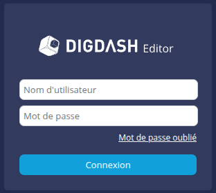
- Enter your user name and password, then click the Log in button: the Dashboard Editor window appears.
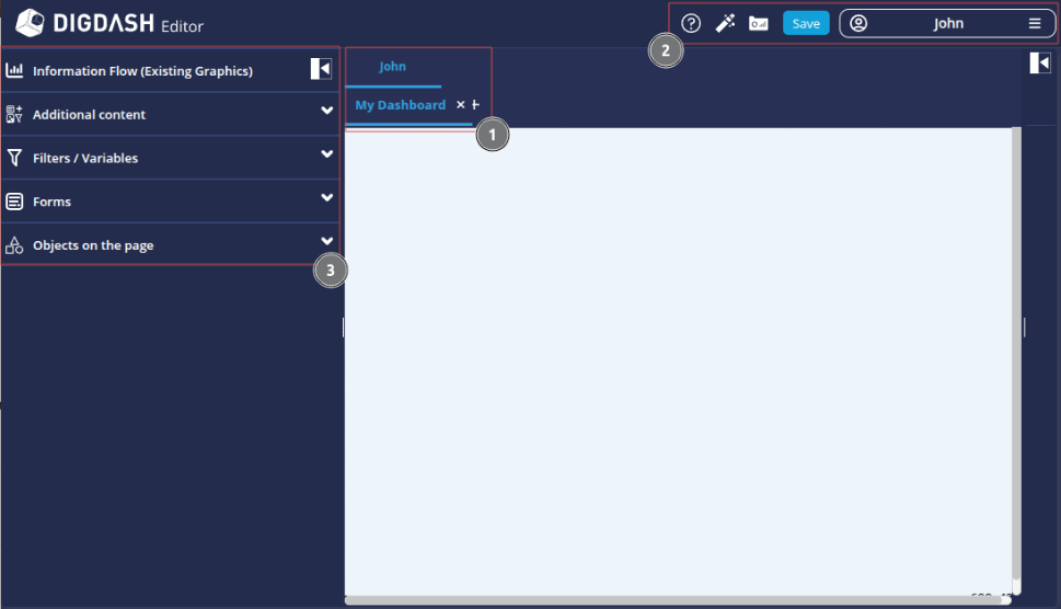
| 1: Roles and pages | The central area displays the dashboard pages (2nd line) for each role (1st line). When you log in for the first time, a page called My Dashboard is automatically created in your personal role (in this example: John). The personal role bears the user's name, and only the user has access to it. |
|---|---|
| 2: Menu bar | The menu bar contains various functions and options:
|
| 3: Page content menu | This menu provides access to the content elements, filters and variables that you can add to the dashboard. |

Accessing the Dashboard Wizard
To access the Dashboard Wizard, click the Dashboard Wizard ![]() on the menu bar. The wizard is displayed.
on the menu bar. The wizard is displayed.

Step 2: Loading data and editing the data model
Now we have logged to DigDash Enterprise for the first time and familiarised ourselves with the home page and the dashboard editor, we're going to discover the Dashboard Creation Wizard.
First, we will load the data. Next, we'll edit the data model to configure new measures and make sure we have the right model for our first charts.
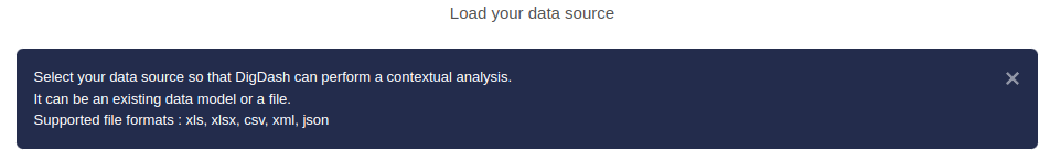
Loading data
Selecting the file
To move through the wizard and create our charts, you have three choices when you open the wizard.
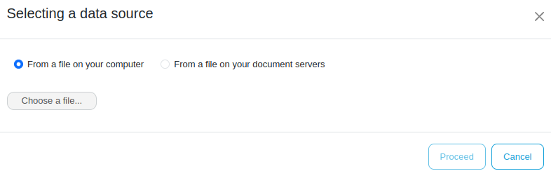
- Click the first button Select a file.
- In the Selecting a data source box, choose From a file on your computer and then click Choose a file...
A window for your operating system will open. - Browse your folders to the folder where you saved the RH_dataset_didacticiel.xlsx file ;
- Select the file and click Open.
Loading the file
A green progress bar will appear to indicate that the file has been correctly and completely downloaded.
A Download completed message confirms that the file has been successfully uploaded.
- Click the Next button.
Editing the data model
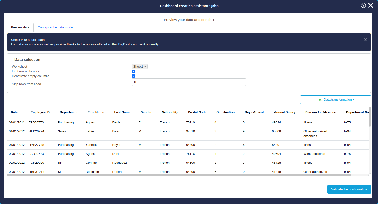
Once the file has been downloaded, the data preview screen appears.
This step will enable us to put our data model in order so that we can build our first charts as effectively as possible.
Data preview
On the screen Analysis results of your data, click the Edit data model at the bottom right to switch to the edit mode.
In the Data selection section, there are options for:
- choose the Excel spreadsheet to be used
- choose the first row as the column header ;
- disable empty columns ;
- ignore a number of header rows.
Here, with our file, everything is already pre-configured thanks to the analysis carried out during loading by DigDash Enterprise to propose an optimal pre-configuration.
Now click the second tab, Configure the data model.
Configuring the data model
In this second tab, we will configure the data model, i.e. :
- give it a name ;
- check that the columns are correctly distributed between dimensions and measurements;
- if necessary, modify this pre-assignment;
- add calculated measurements;
- change the display labels for certain measurements or dimensions.
Naming the data model
In order to clearly identify the data model, which will make it easier to re-use in the future, we are going to name this data model "HR data".
By default, the data model takes the name of the Excel file. To rename it :
- Enter the desired text in the first field Datamodel name.
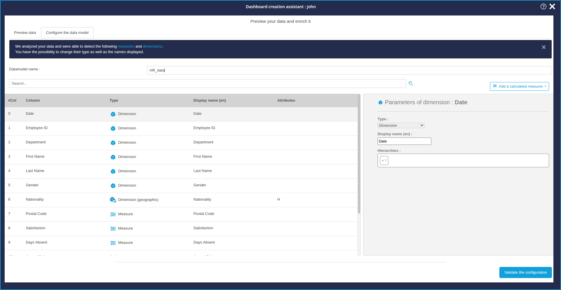
Checking dimension and measurement assignments
Below the name of the data model is a list of the columns in the file, indicating for each column :
- its index (starting at 0)
- name (taken from the identified column header)
- the type :
- dimension
- geographical dimension
- time dimension
- measurement
- and the display name (or displayed value)
Here we are going to check that the type assigned to each column in the file is correct, and modify it if necessary. To do this, let's look at the list of columns:
- In column 7, we can see that the Postal Code is identified as a measure and not as a dimension.
- This is because the Postal code is a series of numbers, and is therefore identified as a number and therefore a measure by DigDash Enterprise.
- To correct this, we can select Dimension from the Type drop-down list on the right-hand panel corresponding to the settings in the Postal Code column.
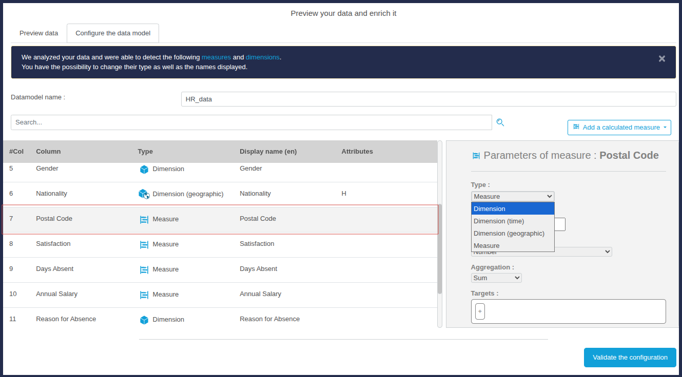
- In column 8, we see that Satisfaction is identified as a dimension. However, this is a measure which evaluates employee satisfaction from 0 to 10.
- This time we can select Measure from the Type drop-down list in the column parameters panel to correct this.
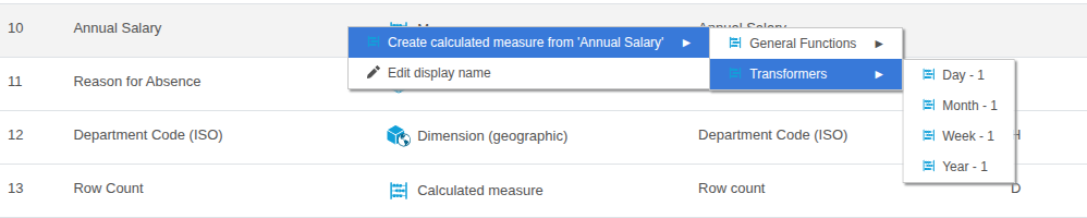
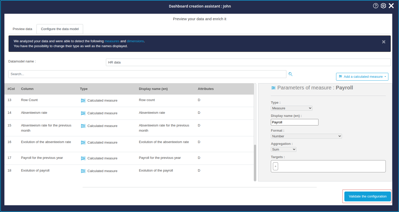
Adding calculated measures
Calculated measures allow you to create the measures you want from measures in the file.
The wizard offers three types of calculated measurement:
- general functions: these are standard functions:
- calculation of a percentage of progress
- calculating a percentage of the total
- calculating a percentage of a measure
- transformers : these functions can be used to create a measure that returns the value of the measure:
- of the day - 1
- of the week - 1
- of the month - 1
- of the year - 1
- formula : this calculated measurement lets you apply your own arithmetic formulas to the available measurements.
Together, we'll look at how to create one or more measures of each of these three types. These measures can then be integrated like all the other measures and dimensions in the charts in the next step.
Here we are going to add measures calculated in relation to absenteeism and payroll.
Formula type measure: Absenteeism rate
Here we are going to create a measure calculating the absenteeism rate. This calculated action will use the following formula:
Number of days of absence in a month for an employee divided by 30 (30 being considered here as the number of days in a month).
To create this action:
- Click on the Add a calculated measure button located above the parameters panel.
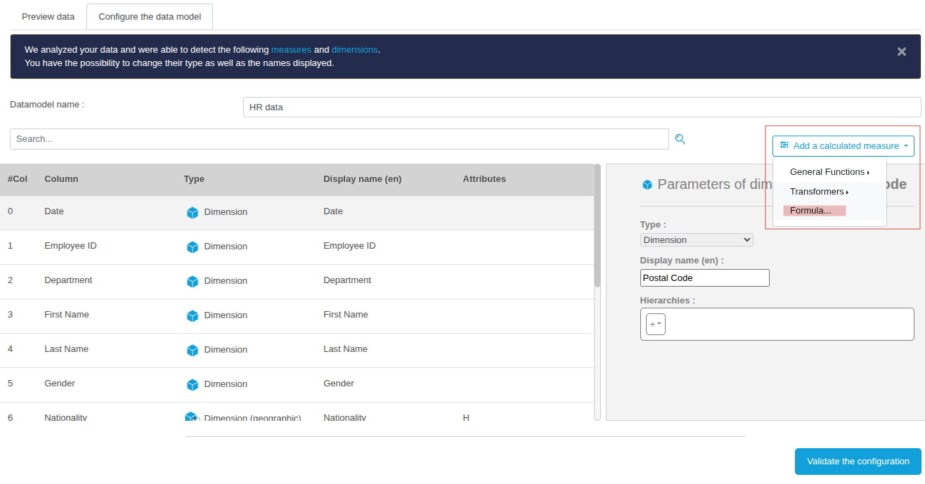
- In the drop-down list which appears, click Formula...
- The Formula Editor window appears.
- Enter the name of the new calculated measure in the first field: Absenteeism rate.
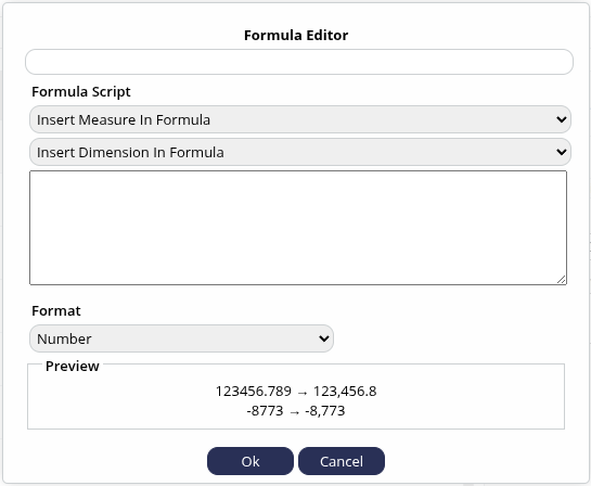
To compose your formula, you need to add the measures and dimensions involved and perform the desired arithmetic operation in the Formula Script section. You can add measures and dimensions by selecting them from the drop-down lists for each category.
- In our case, click Insert Measure in Formula.
- Then select the measure Days Absent: the measure is added in the text box below.
- Before adding the other measure, complete it by writing: " / (30 *) ".
- Then insert the measure Row count.
- Finish by closing the brackets.
The final formula should be as follows:
- Finally, you can indicate the format in which this calculated formula will be displayed: choose the Percent format here.
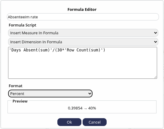
- Finish creating this measure by clicking OK.
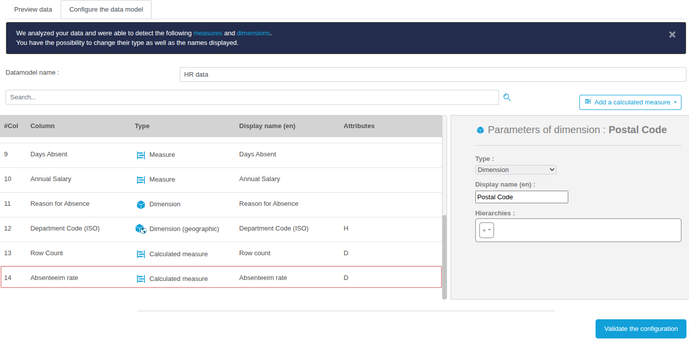
The calculated Absenteeism rate measure that has just been created is displayed at the end of the column list.
Measure with Transformers type: Absenteeism rate for the previous month
Here we are going to create the calculated measure that returns the absenteeism rate for the previous month, based on the calculated measure "Absenteeism rate" that we have just created.
- Click the Add a calculated measure button above the parameters panel.
- In the drop-down list that appears, click Transformers and then on Month - 1.

- In the Month - 1 window which then appears, enter the name of the new calculated measure in the first field: Absenteeism rate for the previous month.
- In the Source Measure drop-down list, choose the measure to which the transformer should be applied to obtain the previous month's value for this source measure.
- Here, choose the measure calculated just recently: Absenteeism rate.
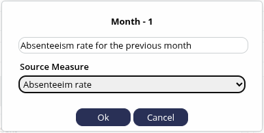
- Finish creating this measure by clicking OK.
The calculated measure Absenteeism rate for the previous month that has just been created is displayed at the end of the list of columns.
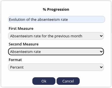
Measure with the general function type (percentage progression) : Evolution of the absenteeism rate
Here we are going to create the calculated measure that returns the evolution between the previous month absenteeism rate and the current rate, based on the first two calculated measures that we have just created.
- Click the Add a calculated measure button above the parameters panel.
- In the drop-down list that appears, click on General Functions and then % Progression.
- In the % Progression window which then appears, enter the name of the new calculated measure in the first field: Evolution of the absenteeism rate.
To calculate a progression type measure, we need to indicate the first measure from which we will measure the evolution with the second measure. We will therefore insert the "oldest" measure in time in the first measure and the most recent in the second.
- In the First measure drop-down list, choose Absenteeism rate for the previous month.
- In the Second measurement drop-down list, choose Absenteeism rate.
- Finally, in the Format drop-down list, leave Percentage selected by default.
- Finish creating this measure by clicking OK.
The calculated measure Evolution of the absenteeism rate just created is displayed at the end of the list of columns.
Transformer type measure: Payroll for the previous year
We are now going to create the calculated measure returning the total payroll for the previous year, based on the measure that already exists: Annual salary.
- Click the Add a calculated measure button above the parameters panel.
- In the drop-down list which appears, click on Transformers and then on Year - 1.
- In the Formula Editor window which then appears, enter the name of the new calculated measure in the first field: Payroll for the previous year.
- In the Source measure drop-down list, choose the measure to which the transformer should be applied to obtain the previous month's value for this source measure.
- Here, choose the measure: Annual Salary.
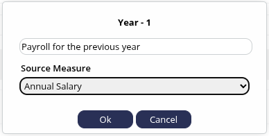
- Here, choose the measure: Annual Salary.
- Finish creating this measure by clicking Ok.
The calculated measure that has just been created is displayed at the end of the list of columns.
General function measure (percentage increase) : Evolution of the payroll
We are now going to create a measure to calculate the change in the total payroll between one year and year -1, using the existing measure Annual Salary and the newly created calculated measure Payroll for the previous year.
- Click on the Add a calculated measure button above the parameters panel.
- In the drop-down list that appears, click on General functions and then on % Progression.
- In the % Progression window which then appears, enter the name of the new calculated measure in the first field: Evolution of the payroll.
To calculate a progression type measure, we need to indicate the first measure from which we will measure the change with the second measure. We will therefore insert the "oldest" measure in time in the first measure and the most recent in the second.
- In the First measure drop-down list, choose Payroll for the previous year.
- In the Second measure drop-down list, choose Annual salary.
- Finally, in the Format drop-down list, leave Percentage selected by default.
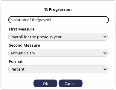
- Finish creating this measure by clicking OK.
The calculated measure, Evolution of the payroll, which has just been created, is displayed at the end of the list of columns.
We have now finished adding calculated measures.
Modifying display labels
As the final stage in configuring our data model, we will now look at how to rename the column identifiers.
These identifiers, taken from the columns in the Excel file, may not be very representative of your business area, or very meaningful, etc. It is therefore entirely possible to rename them so that they can be displayed clearly in the graphs.
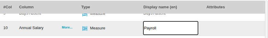
In the example we are following in this tutorial, we see that the measure in column #10 is called "Annual Salary", which is inconsistent with the other measures recently created bearing the name "Wage bill".
We will therefore first rename the name "Annual salary" in column 10 to "Payroll":
- Move the mouse over the line in column 10 "Annual salary": the line is coloured grey and a More... button appears.
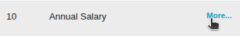
- Click More...
- In the pop-up menu that appears, click Edit value displayed.
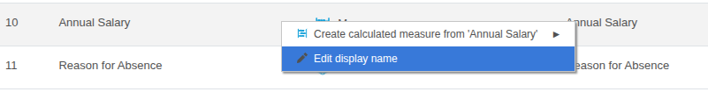
The field containing the value displayed can now be modified.
- Enter Payroll.
- Click anywhere outside the field to complete the entry.
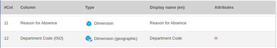
We can do the same to rename Department Code (ISO) to Department Code :
Validate
We have now completed the steps of loading the data and configuring the data model.
You can now click on the blue button at the bottom of the list of columns: Validate the configuration.
Step 3: Creating the customised dashboard: first charts
Once we've loaded the data and edited the data model, we'll move on to creating the charts we'll use to build our first Absenteeism dashboard .
We can insert these charts into the dashboard using an intelligent layout proposed by the Dashboard Creation Assistant.
To proceed with the creation of the dashboard, click Continue from the Analysis results page of your data.
The Build your own dashboard page then appears.
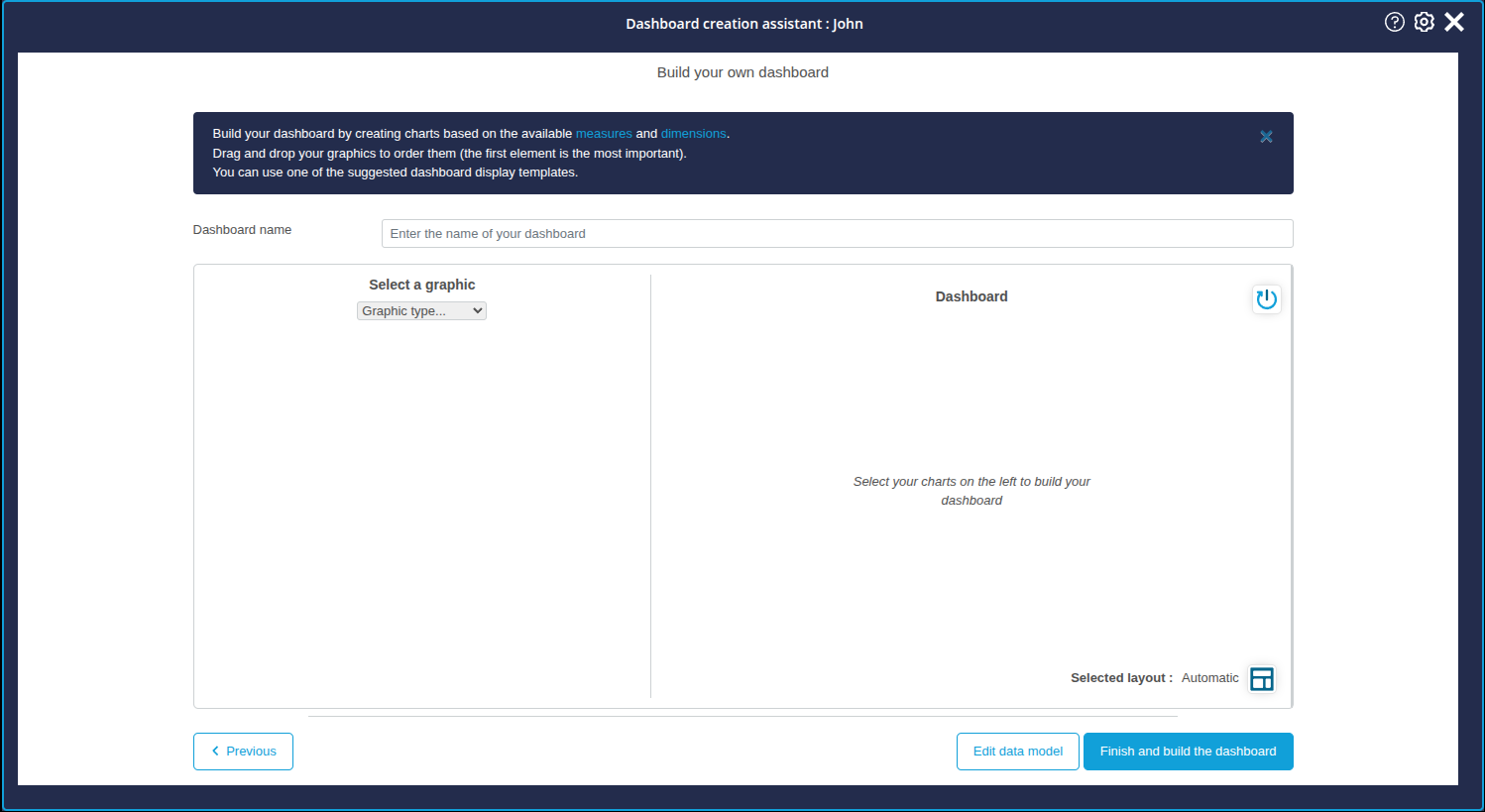
In this section, the assistant is divided into two vertical sections:
- on the left is the chart configuration section: this is where you can configure the charts you want, before adding them to the list of charts to be inserted in the dashboard page you are creating.
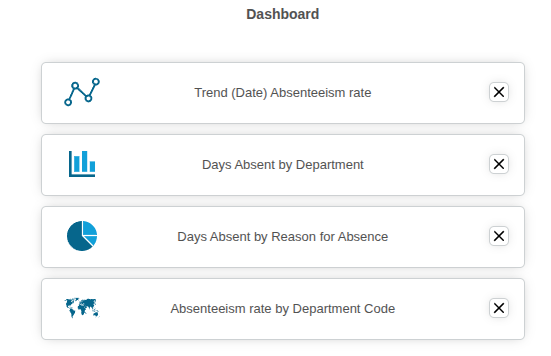
- on the right is the list of charts selected for display on the dashboard page.
General operation
The charts to be displayed on the dashboard page are prepared as follows:
- Choose a chart from the custom charts or charts offered by DigDash Enterprise;
- Configure dimensions and measurements;
- Add it to the list of charts on the dashboard page being created.
This process must be repeated as many times as necessary to add a chart to the dashboard.
Creating the charts
First, we are going to create and add four charts relating to absenteeism in the company:
- Trend in absenteeism rate
- Number of days of absenteeism per department
- Causes of absenteeism
- Map: absenteeism rate by department
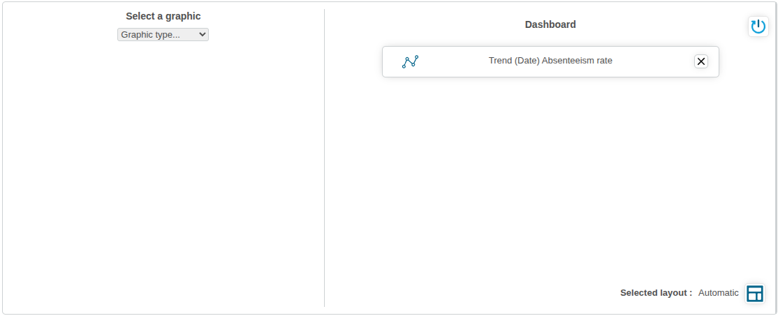
Creating the "Evolution of the absenteeism rate" chart
In this first chart, we are going to create a Lines chart showing the evolution of the absenteeism rate.
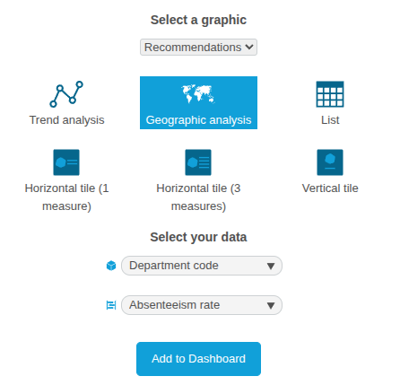
This chart is already almost ready, because DigDash Enterprise's intelligence has detected that it could be used in an interesting way. That's why it's included in the Recommendations, which will enable us to configure it even more quickly!
To do this
- In the Select a graphic drop-down list, select Recommendations.
- From the available charts, click Trend analysis.
In the data selection box that appears, the dimension is automatically set to Date. - Select Absenteeism rate from the list of measures.
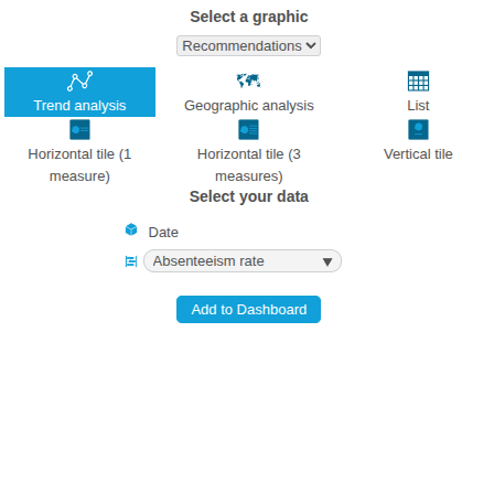
- Click the Add to dashboard button.
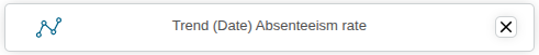
The Trend (Date) Absenteeism Rate chart is then added to the Dashboard section. You can view it, rename it and even configure it in more detail in the next step!
Creating the "Number of days of absenteeism by department" chart
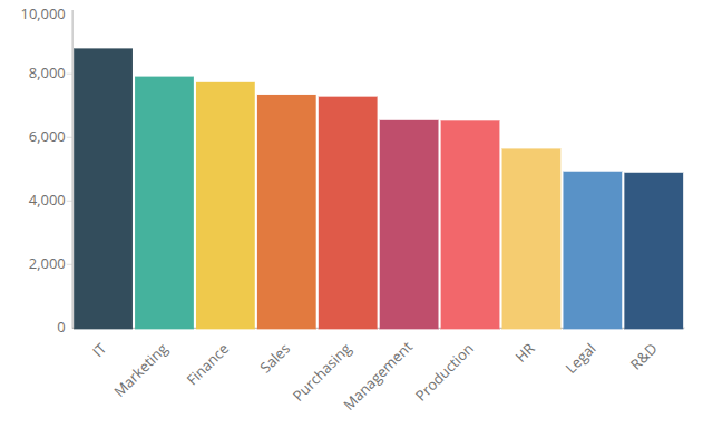
For this chart, we're going to create a histogram showing the number of days of absenteeism per department.
To do this
- In the Select a graphic drop-down list, select Compare.
- From the available charts, click Columns to select a columnar representation.
A data selection box is displayed below. - In the Choose a dimension drop-down list, select Department.
- In the Choose a measure drop-down list, select Days absent.
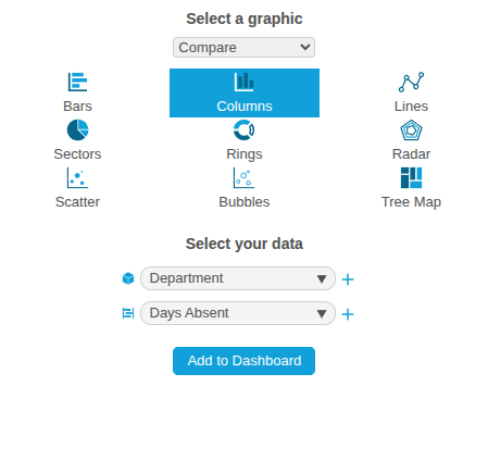
- Click the Add to Dashboard button.
The Days Absent by Department chart is then added to the Dashboard section. You can view it, rename it and even configure it in more detail in the next step!
Creating the “Causes of Absenteeism” chart
We're now going to build a pie chart representing the distribution of causes of absenteeism.
To do this:
- From the Select a graphic drop-down list, select Compare.
- From the available charts, click Sectors to select a pie chart.
A data selection box is displayed below. - In the Choose a dimension drop-down list, select Reason for absence.
- From the Choose a Measure drop-down list, select Days Absent.
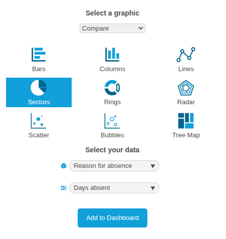
- Click the Add to Dashboard button.
The Days absent by reason for absence chart is then added to the Dashboard section. You can view it, rename it and even configure it in more detail in the next step!
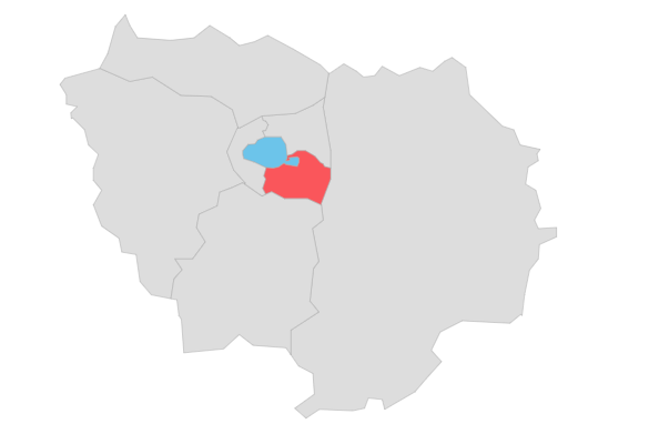
Creating the "Absenteeism rate per French department" chart
We're now going to create a map showing the absenteeism rate per department. This chart is already almost ready, because DigDash Enterprise's intelligence has detected that it could meet an interesting use case. This is why it is included in the Recommendations, which will enable us to configure it even more quickly!
To do this
- In the Chart type drop-down list, select Recommendations.
- From the available charts, click on Geographic Analysis.
- In the data selection box that appears, select Department Code from the list of dimensions.
- Then select Absenteeism rate from the list of measures.
- Click on the Add to dashboard button.
The Number of days of absenteeism by department graph is then added to the Dashboard section. You can view it, rename it and even configure it in more detail in the next step!
Naming the dashboard
Before continuing, don't forget to name the dashboard.
At the very top of the page, in the Dashboard name field, you can enter the name of the new page being created.
Enter Absenteeism here.

Choosing the layout
We have just created 4 charts, which will be the charts of the Absenteeism dashboard.
DigDash Enterprise offers several layouts for arranging these charts on a page. These layouts automatically arrange the charts on the page, to save you time.
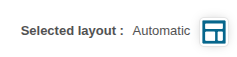
At the bottom of the list of charts to be inserted into the page you are creating, notice"Layout selected: Automatic".
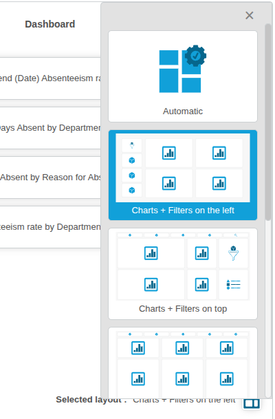
By clicking the ![]() button, a drop-down list appears with several layout choices.
button, a drop-down list appears with several layout choices.
At the very top, the first choice is Automatic : DigDash Enterprise will take care of all the layout logic.
At the bottom of this first choice, you can adjust the automated layout according to your preferences.
Note the different symbols in the layout zones: they correspond to the content that will be added automatically:
- charts
- dimensions for filtering
- filtered elements
- Select the layout Charts + Filters on the left.
- Close the drop-down list using the cross at the top right.
- The selected layout is then updated with: Charts + Filters on the left.
After this last step, we'll leave the Wizard and return to the Dashboard Editor to fine-tune the dashboard.
Click Finish and build the dashboard at the bottom right of the Dashboard Creation Wizard window :
- The Dashboard Creation Assistant closes.
- The data model is saved.
- The Absenteeism dashboard page is displayed in the Dashboard Editor with the 4 charts we have just created.
Step 5: Finalising the Absenteeism dashboard page
Once we've loaded the data, edited the data model and configured the graphs we want to see in our first corporate absenteeism dashboard, we've nearly reached the end of the road! We've just returned to the Dashboard Editor, and the 4 configured charts are already displayed on our 'Absenteeism' page.
So this part of the tutorial will show us how to fine-tune the page we've just created. In particular, we'll see :
- how to add dimensions as filters ;
- how to modify charts that have already been created;
- how to rename and access the properties of charts.
This part will also be an opportunity to familiarise ourselves further with the editor.
Back to the Dashboard Editor
In the previous section, we configured the first charts.
They are now arranged on your first dashboard page, which you are now viewing in the editor.
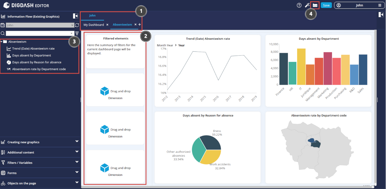
Let's look at a few things by following the numbered elements above:
- The page created belongs to your personal role and has the name you chose in the previous step: Absenteeism page belonging here to the personal role John.
- The Filtered elements section has been automatically added: this space will allow you to list the dimensions that have been filtered (and the members to which these filters apply).
- The Information Flow (Existing Graphics) section has been opened:
- This section contains all the charts we created in the previous step;
- Note that the role (or wallet) open is your personal role; later, you will be able to open another wallet for your organisation;
- In the event that you accidentally delete one of the charts inserted on the page, you can reposition it on the page from this space by simply dragging and dropping it to the desired area on the page;
- Note also that the 4 charts on the current dashboard are all grouped together in a category with the same name as the page created.
- At any time, you can view the dashboard in its final state by clicking on the Access the dashboard button .
This switch to viewing also allows you to save the changes you have made in the editor.
Let's now move on to finalising this first page dedicated to absenteeism.
Finalising the page
Adding filters
Any self-respecting dashboard should be able to offer its users the option of filtering on its dimensions. That's what we're going to do now. We're going to add the "Date", "Department" and "Gender" dimensions as filters.
To do this:
- In the left-hand column of the page you are editing, notice the three rectangles inviting you to "Drag and Drop Dimension".
It is in these three zones that we are going to insert our three dimensions. - Click on the Dimension link in the first rectangle: the Filters/Variables section opens in the left-hand banner with the list of Dimensions.
- Drag and drop the Date dimension onto the first rectangle: the date filter elements will then be displayed there.
- Repeat the operation for the Department dimension and the Gender dimension, using the other 2 rectangles.
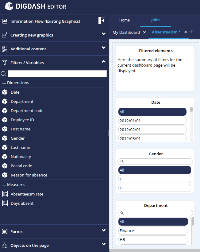
Note that the Date dimension displays its members in day/month/year format.
To switch to year format :
- Hover the mouse over this Date dimension.
- Click on the cogwheel
 which appears.
 - Select Settings in the pop-up menu, then Properties: the Date panel then opens in the Properties section on the right of the dashboard.
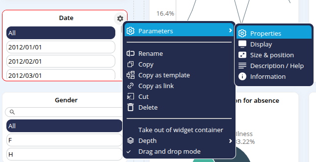
- In the Hierarchy drop-down list, select Date.
- In the Level drop-down list, select Year.
- Further down, in the View Type drop-down list, select Vertical List.
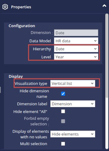
- Click on OK.

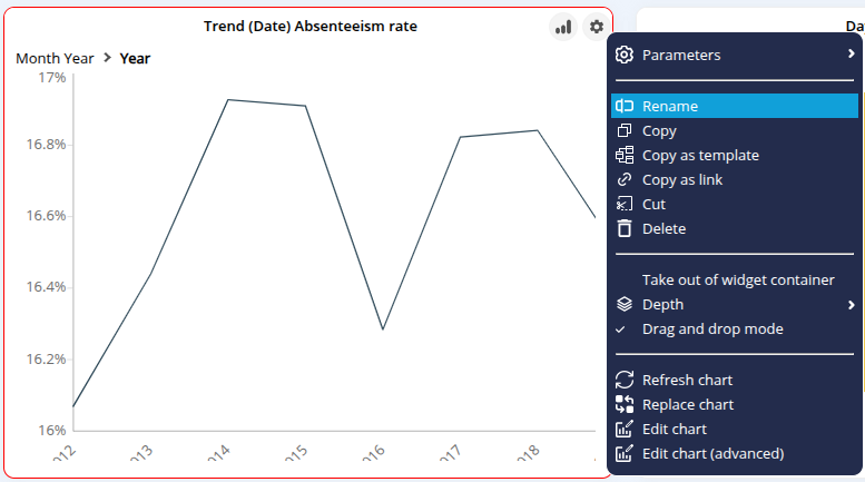
Renaming charts
As you will no doubt have noticed, automatically created charts have automatically generated names which are sometimes difficult to understand.
In this section, we are going to rename the charts so that they have a more meaningful name.
To do this:
- Hover the mouse over the graph Trend (Date) Absenteeism rate.
- Click on the cogwheel which appears in the top right-hand corner.
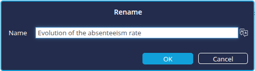
- Click Rename in the context menu.
- In the Rename dialog box that appears, enter the new name: Evolution of the absenteeism rate.
- Click OK to confirm.
You can also open the Rename box by double-clicking on the title of the chart.
Do the same to rename :
- Days absent by Department to Number of absenteeism days by department
- Days absent by Reason for absence in Causes of absenteeism
- Absenteeism rate by Department Code to Absenteeism rate by French department
Modifying graphs that have already been created
Now that your page is taking shape with filters and clearly named charts, it’s important to ensure the charts are consistent and comply with any company or departmental rules.
That’s why we offer you the option to make in-depth changes to existing charts directly from the editor.
Here, we will look at how to :
- change the level of the Date dimension of the Evolution of absenteeism rate graph to display dates at quarter level ;
- add sorting on the measure for the Number of days of absenteeism by department histogram;
- change the colours of the Absenteeism rate by French department chart.
General operation
First of all, let's explain how to modify charts already created in the editor:
- When you hover the mouse over the chart area, a chart icon
 appears in the top right-hand corner.
 - Click on it to open the chart editing window.
- In this editing window :
- the central area shows a preview of the changes you have made ;
- the left-hand column shows a number of elements and options, including the dimensions and measurements which can be added to or substituted for each graph;
- When you hover over this left-hand column, a configuration zone appears above the central preview area:
- This is where you can add measurements and dimensions by dragging and dropping from the left-hand column;
- This is also where you can modify the configuration of the dimensions and measurements already in place;
- Once you have completed your modifications, you can save them by clicking on the Save button
 button at the top right.
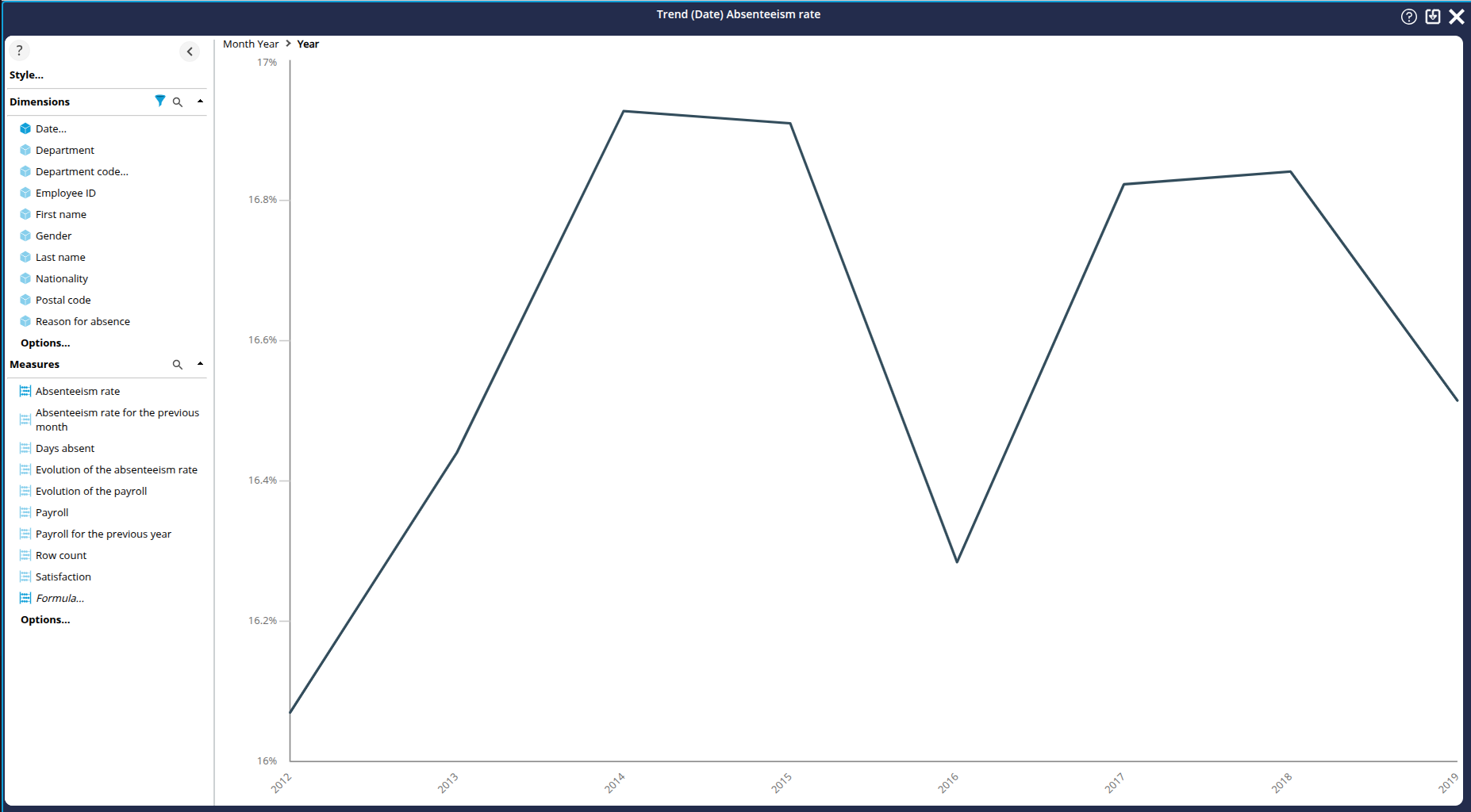
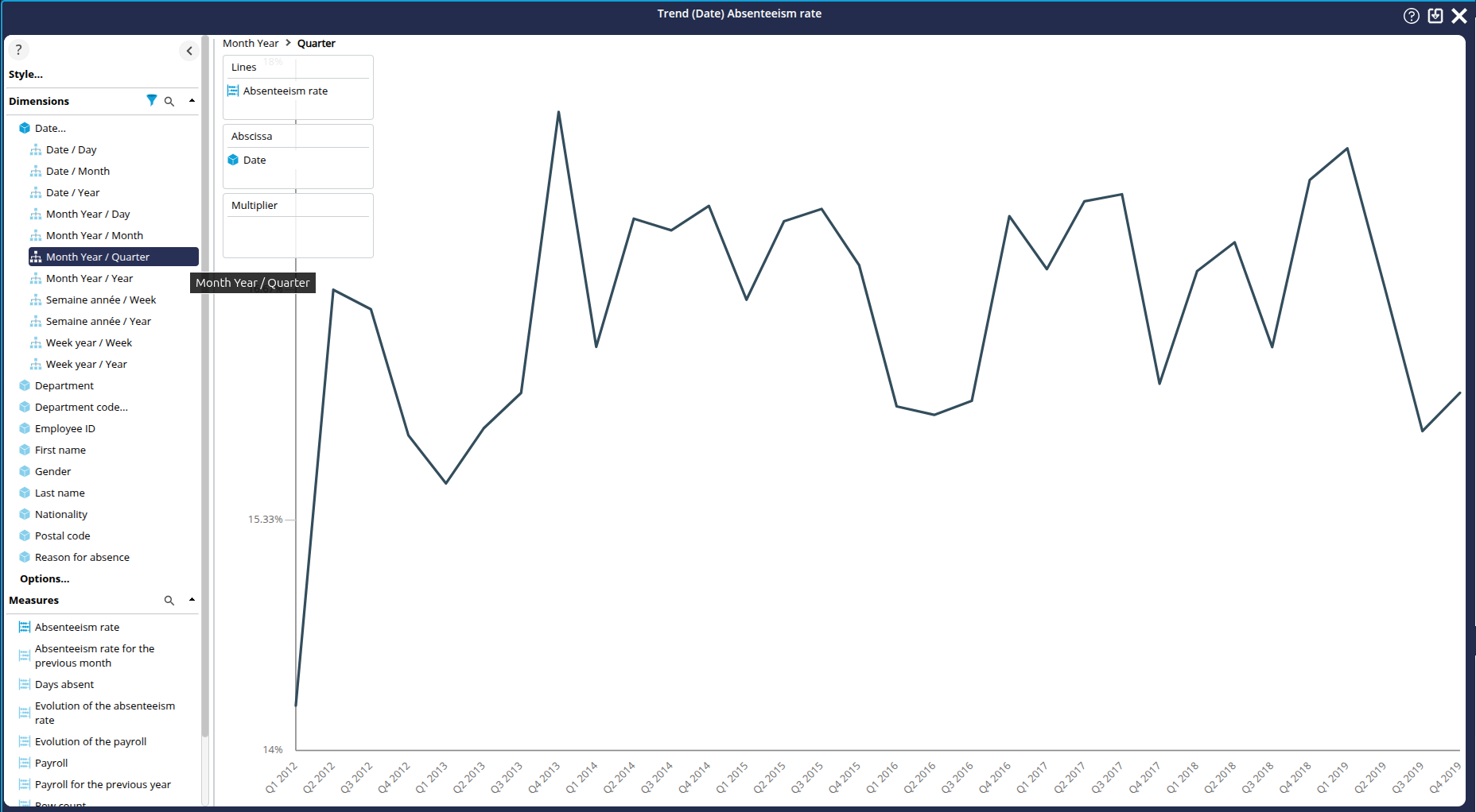
Evolution of the absenteeism rate: display dates in quarter format
In this first chart, we're going to enter edit mode to display the dates in the online chart in quarter format.
To do this:
- Hover over the Evolution of the absenteeism rate chart area in the editor page .
- Click on the chart icon
 that appears: the editing window for this chart is displayed.
 - In the left-hand column, in the Dimensions section, click on Date...
- Locate the hierarchy/level pair Month Year / Quarter
- Drag and drop this hierarchy/level pair onto the Abscissa axis.
- Save your changes using the Save icon in the top right-hand corner
The dates in the chart are now displayed in quarter format!
Number of days of absenteeism by department: sort by measure
In this second chart, we're going to enter chart editing mode to define a sort by measure.
To do this:
- Hover over the Number of days of absenteeism by department chart area in the editor page.
- Click on the chart icon that appears: the editing area for this chart is then displayed.
- In the configuration area, right-click on Column.
- In the pop-up menu that appears, click on Change the sort: the Add Sort dialog box appears.
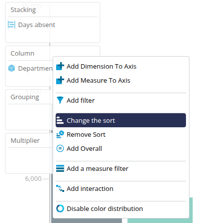
- In the Sort drop-down list, select Descending sort on measure.
- In the Measure drop-down list, keep the Days absent selection.
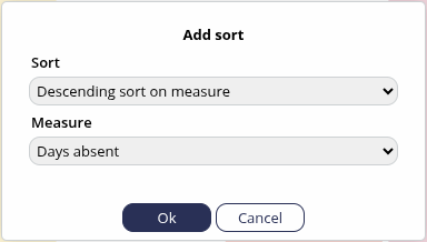
- Click OK: The columns are now sorted from the highest to the lowest number of days of absenteeism.
- Save the changes using the Save button in the top right-hand corner. .
Absenteeism rate per French department: changing the colours used
Here we are going to enter the chart editing mode in order to change the colours used in the mapping. As it stands, the default colours do not allow you to differentiate between the different rates at first glance.
- Hover over the Absenteeism rate by department chart area in the editor page.
Click on the chart icon
that appears: the editing window is displayed.- In the left-hand area, click on Style..., then on Colors . ..
The Select color palette box appears.
By default, the "Flat Design" colour palette is selected. - Select the Color gender palette.
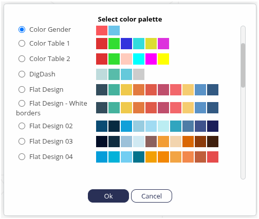
- Click OK : the colours are modified for better viewing.
- Then save the changes using the Save button. button at the top right.
Step 6: Creating a second "Payroll" dashboard page
Having created the first page of our absenteeism dashboard, we're now going to create a second page dedicated to payroll.
We'll be looking at
- how to add a new page ;
- how to create new charts from the data source added and configured in the previous sections; and
- and how to insert and configure these new charts in the new page.
Adding a new page and choosing a layout
As we saw earlier, the Absenteeism page belongs to your personal role, with your user name. We're going to add a second page, still in this personal role. During creation, we will choose a layout for our new page.
- Click on the + symbol to the right of the Absenteeism page.
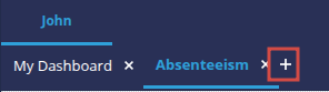
- The Add page box appears.
- Enter the name of the page: Payroll.
- We are now going to choose how the page is displayed: click on Templates...
➡ The Template selection section appears. - For greater consistency with the previous page, we're going to choose the same layout: click on Charts + filters on the left.
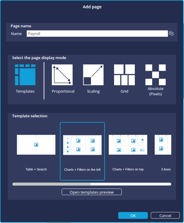
- Confirm the creation of the new page by clicking OK again in the Add page box.
➡ The Payroll page now appears.
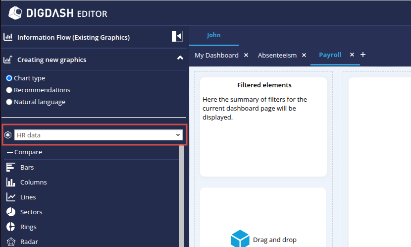
Creating new charts
The new Payroll page has now been created! We're now going to configure the new charts.
How to create new charts from the editor
On the left-hand side of our pages, the Information flows (Existing graphics) tab is open and shows the information flows that already exist.
Let's open the Creating new graphics tab by clicking on it. The chart configuration tool is similar to the one we used earlier in the wizard.
Note that the HR Data data model is automatically selected. We are going to use this data model to create our new charts.
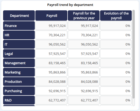
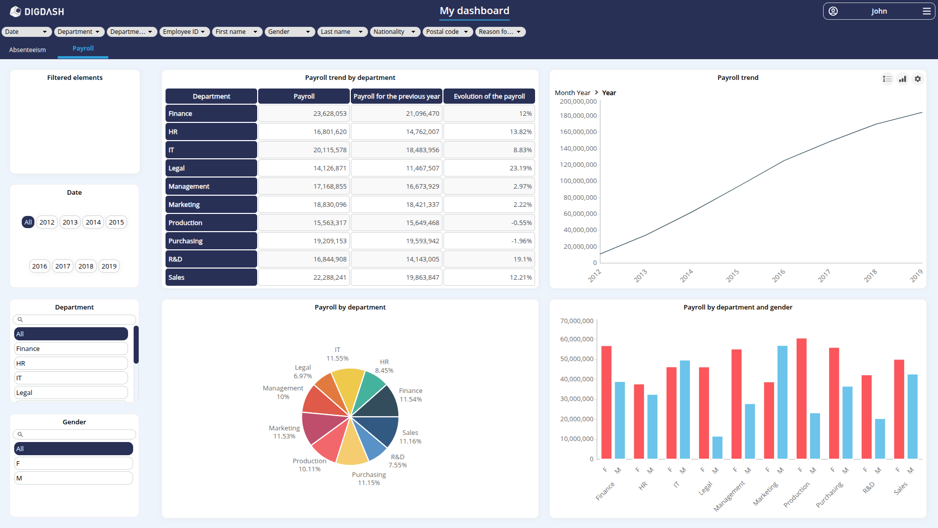
Creating the "Payroll trend by department" chart
This first chart, in the form of a table, will show changes in the total payroll by department. We will then apply a filter to show changes in each department over the last year only.
Configuration
- In the Creating new graphics section, select the Chart type option if required and locate the Tables sub-section.
- Select Cross table and drag and drop to the first rectangle Drag and drop Chart at top left.
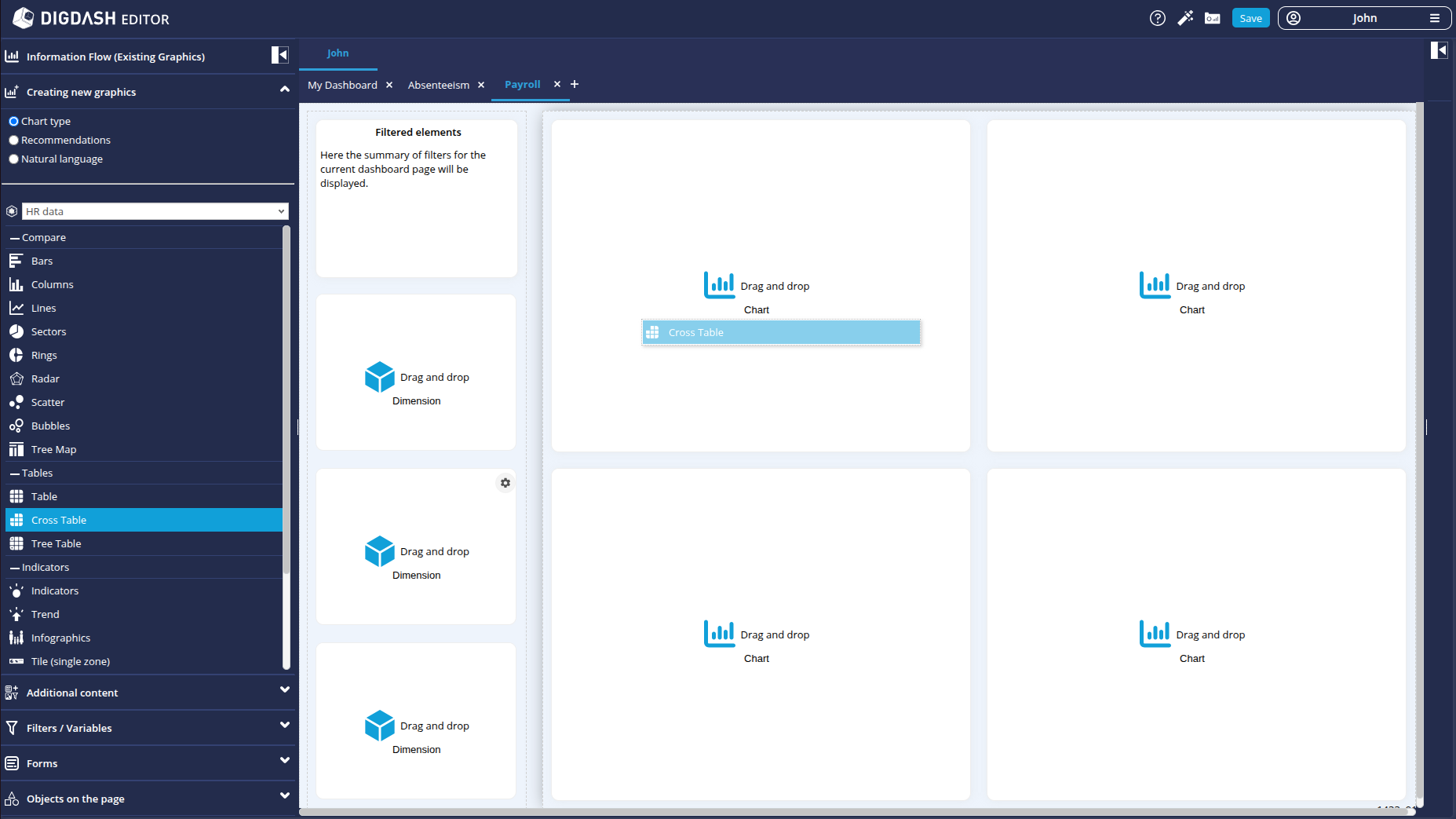
➡ The Creating a new chart box appears.
- Enter the name of the chart: Payroll trend by department.
In this table, we are going to represent, for each department, the payroll for the previous year, the payroll for the current year and the rate of change between these two years. We will therefore need one dimension and three measures to configure this table.
- In the Choose a dimension drop-down list, check the Department dimension.
- In the Choose a measure drop-down list, check the measures:
- Payroll
- Payroll for the previous year
- Evolution of the payroll
- Click Add the chart to confirm: the Payroll trends by department table is added to the dashboard page.
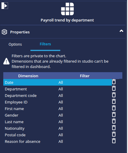
Filtering
We are now going to filter this chart so that it takes into account the last year of our dataset. The filter we create here will be exclusive to this chart and will not be propagated to the other charts.
- Position the mouse cursor over the chart.
- Click on the cogwheel
 which appears at the top right of the graph.
 - In the pop-up menu that appears, click on Parameters then Properties: the Payroll trend by department panel then opens on the Properties section on the right of the dashboard.
- Below Properties, click on the Filters tab.
In this tab, the dimensions that can be filtered are displayed: there are currently no filters configured. - Click on the All filter corresponding to the Date dimension.
➡ The Filter: Date dialog box appears, allowing you to configure the filter.
- From the Filter Type drop-down list, select Predefined.
- In the second Context drop-down list, select Max data date.
- In the Member drop-down list, select Year.
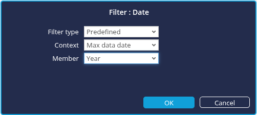
- Click OK to confirm: the chart is updated on the dashboard page.
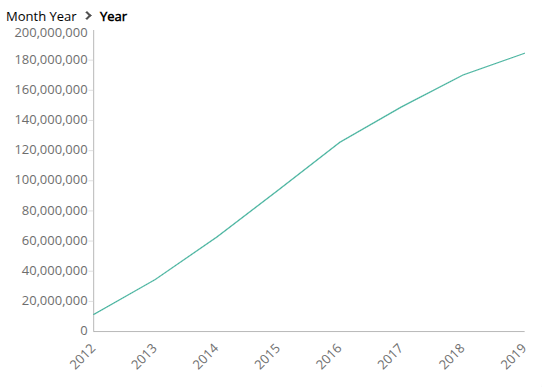
Creating the "Payroll trend" chart
We are now going to create a second chart, in the form of a curve, which will represent the evolution of the total payroll over the years. To do this:
- In the Creating new graphics tab, select Recommendations.
- From the list of suggested charts, select Trend analysis and drag and drop to the second rectangle Drag and drop Chart at top right. The Creating a new chart appears.
- Enter the name of the chart: Payroll trend.
- The dimension is automatically set to Date.
- In the Measure drop-down list, check Payroll.
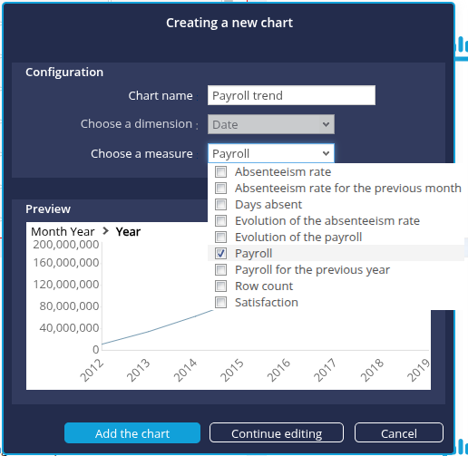
- Click on Add the chart : the new Payroll trend chart is added to the dashboard page.
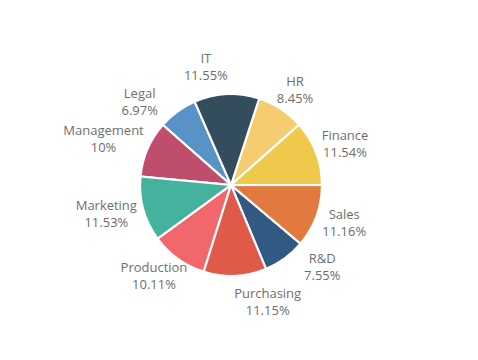
Creating the "Payroll by department" chart
We are now going to create a third chart, this time in sectors, which will represent the breakdown of payroll by department.
- In the Creating new graphics section, select Chart type.
- Locate the Compare sub-section.
- Select Sectors and drag and drop it to the third rectangle Drag and drop Chart at the bottom left.
➡ The Create a new chart box appears. - Enter the name of the chart: Payroll by department.
- In the Choose a dimension drop-down list, check Department.
- In the Choose a measure drop-down list, check Payroll.
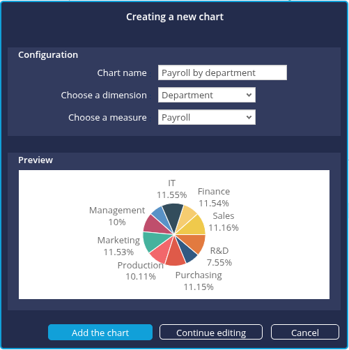
- Click on Add the chart : the new Payroll by department chart is added to the dashboard page.
Creating the "Payroll by department and gender" chart
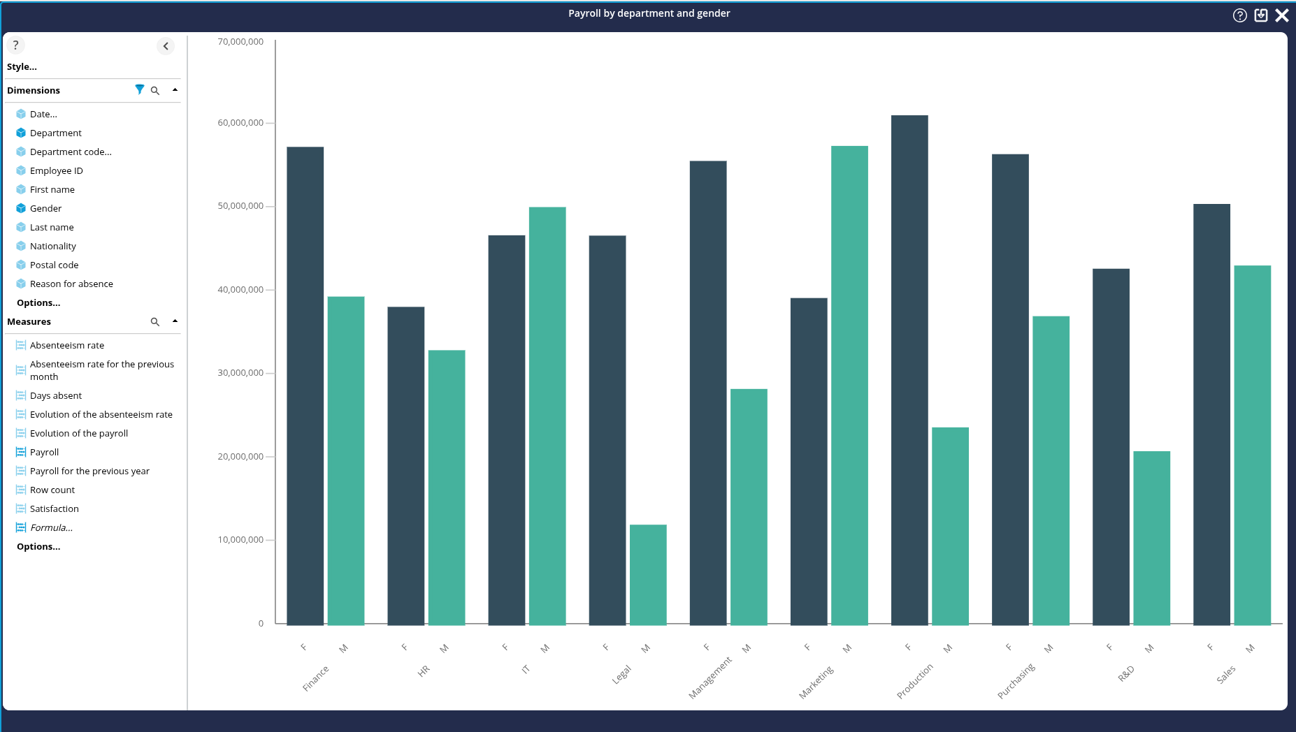
Finally, we're going to create a fourth chart, a column chart, which will show the breakdown of payroll by department while also allowing the gender distinction to be represented.
Configuration
- In the Creating new graphics section, select Chart type.
- Locate the Compare sub-section.
- Select Columns and drag and drop to the fourth rectangle Drag and drop Graph at bottom right.
➡ The Create a new chart box appears. - Enter the name of the graph: Payroll by department and gender.
- In the Choose a dimension drop-down list, check Gender then Department.
- In the Choose a measure drop-down list, check Payroll.
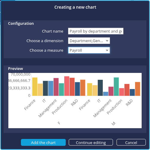
- Click on Add the chart : the new Payroll by department and gender chart is added to the dashboard page.
Dimensions are not placed on the desired axes. We want to group by department and not by gender. - Click on the Continue editing button.
Modification of the axis
To place dimensions on the right axes:
- Remove dimensions from the Grouping axis : right click Grouping and click Remove.
- Drag and drop Gender on the Column axis to replace Department.
- Drag and drop the Gender dimension to the Column axis and the Department dimension to the Grouping axis.
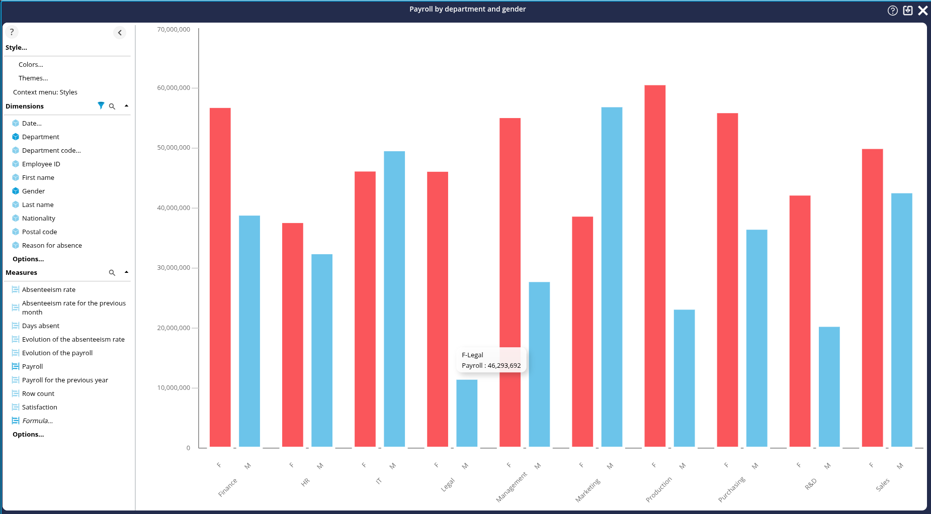
Application of a meaningful colour palette
- In the left-hand area, click on Style..., then on Colors : the Select color palette box appears.
- Select the Color Gender colour palette.

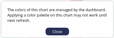
The colours in the palette are applied automatically and a warning message is displayed. The new color palette is automatically applied in the edit area of the graph, but not necessarily on the dashboard page. Applying the new color palette in the dashboard may therefore require a refresh of the dashboard page.
- Save by clicking on the Save button button in the top right-hand corner: the graph editing area closes.
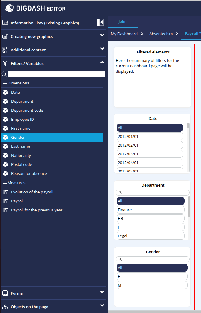
Adding filters
Our page is almost ready. All that remains, as we did for the previous page, is to add the dimensions to enable us to filter in view mode.
To do this:
- In the left-hand column of the page you are editing, notice the three rectangles inviting you to"Drag and Drop Dimension".
That is where we are going to insert our three dimensions. - Click on the Dimension link in the first rectangle: the Filters/Variables section opens in the left-hand banner with the list of Dimensions.
- Drag and drop the Date dimension onto the first rectangle: the date filter elements will then be displayed there.
- Repeat the operation for the Department dimension and the Gender dimension, using the other 2 rectangles.
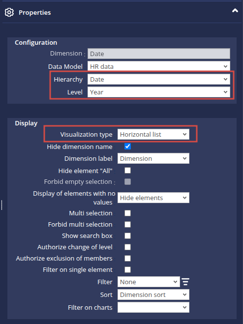
Note that the Date dimension displays its members in day/month/year format.
We're going to switch to year format:
- Hover the mouse over this Date dimension.
- Click on the cogwheel which appears.
- Select Parameters in the pop-up menu, then Properties: the Date panel then opens in the Properties section on the right of the dashboard.
- In the Hierarchy drop-down list, select Date.
- In the Level drop-down list, select Year.
- Further down, in the View Type drop-down list, select Horizontal list.
Step 7: Viewing the dashboard
You can now view the final result of your work!
To do this, as you saw before, click on the Access to the dashboard button at the top right of the window.
You can now navigate your 2 Absenteeism and Payroll dashboard pages and test the use of the filters.
Congratulations!
From our Excel file, we were able to create a real dashboard using the DigDash Enterprise Dashboard Creation Assistant.
We saw how to :
- load a file ;
- edit the data configuration and create a data model;
- configure charts based on this data model;
- configure dashboard pages to add filters;
- modify the default view generated by going into more detail in the parameters.
Going further
You can go even further!
With the Studio, DigDash Enterprise lets you go into more detail about configuring your data models, connect to your databases or join or combine several data sources.
Don't hesitate to get in touch with your DigDash Enterprise administrator or your DigDash referral contact to discuss this!